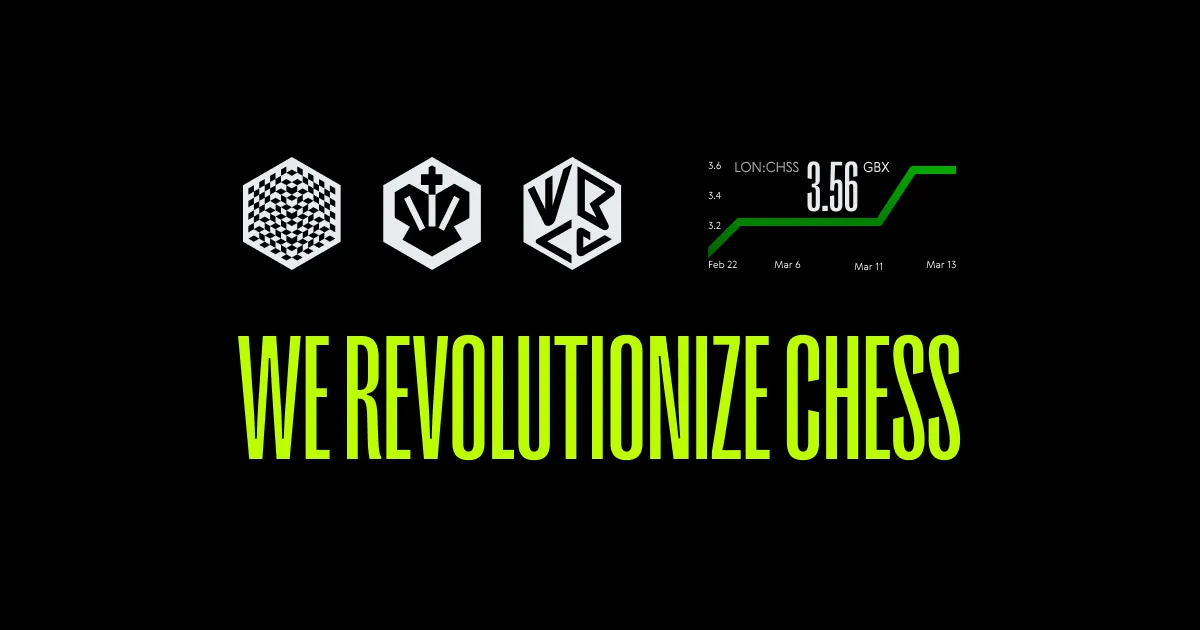
When I took on my second redesign of the game interface, the goal was simple—make online chess look and feel better, while also making it easier to get players more involved. We gave the whole interface a fresh look with new branding and worked on turning casual players into FIDE-rated competitors.
I also designed some cool new features, like in-game reactions interface to make things more lively and a revamped viewer mode that gave spectators more ways to stay hooked. Overall, on the one hand, it was about making the whole experience smoother and more fun for everyone, and on the other—a strategic effort to drive key metrics like LTV, engagement rates, conversion rates, and player retention, while opening up new opportunities for ongoing improvements.
• Online chess interface design
• Conversion rate optimisation
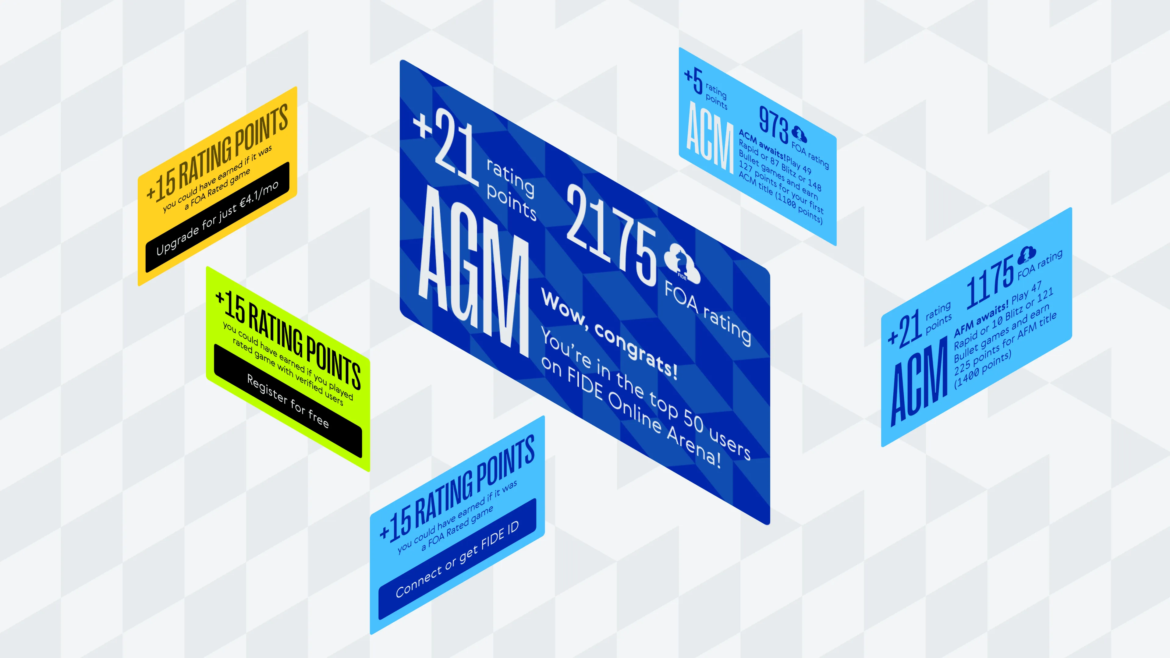
• FIDE Online Arena rating flow
• In-game reactions
• Viewer mode enhancements
• Game report redesign
• Upsell opportunities
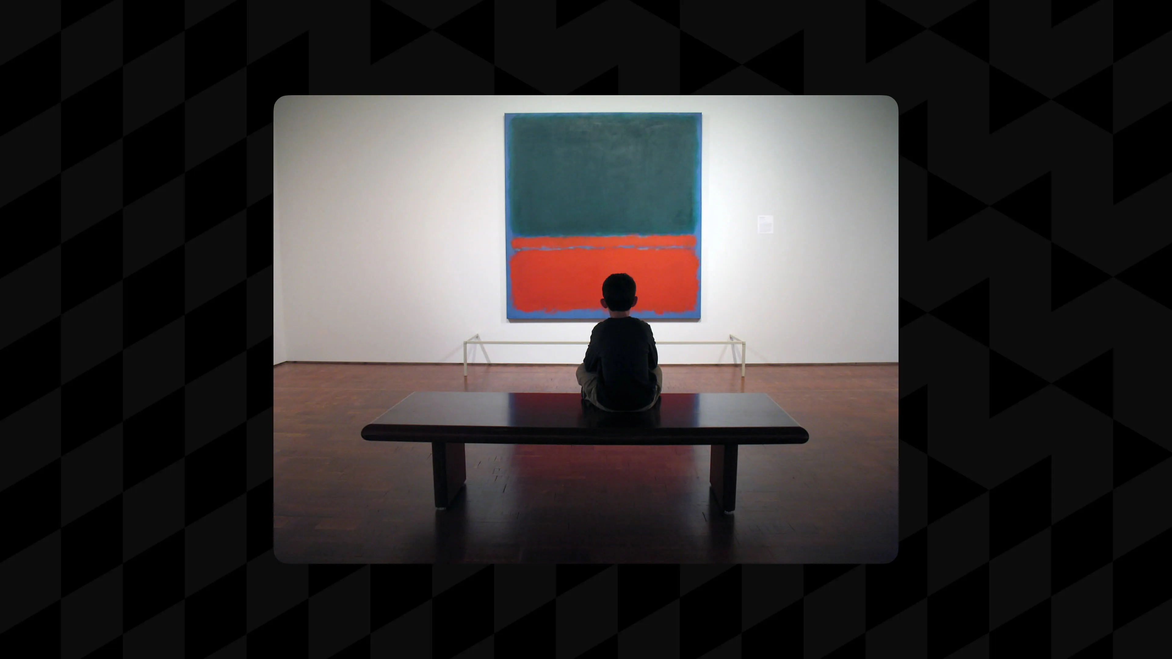
• Mark Rothko reference
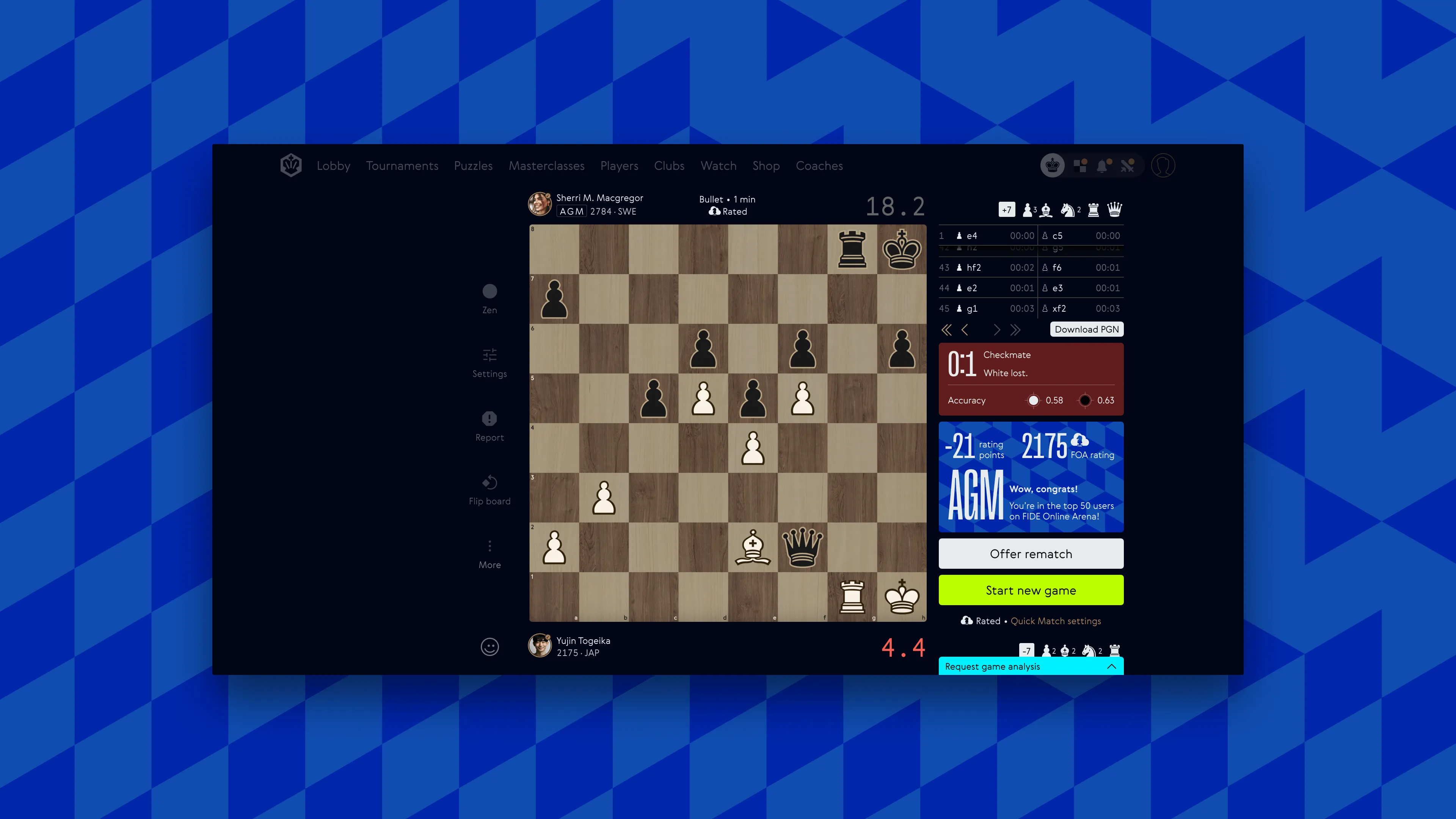
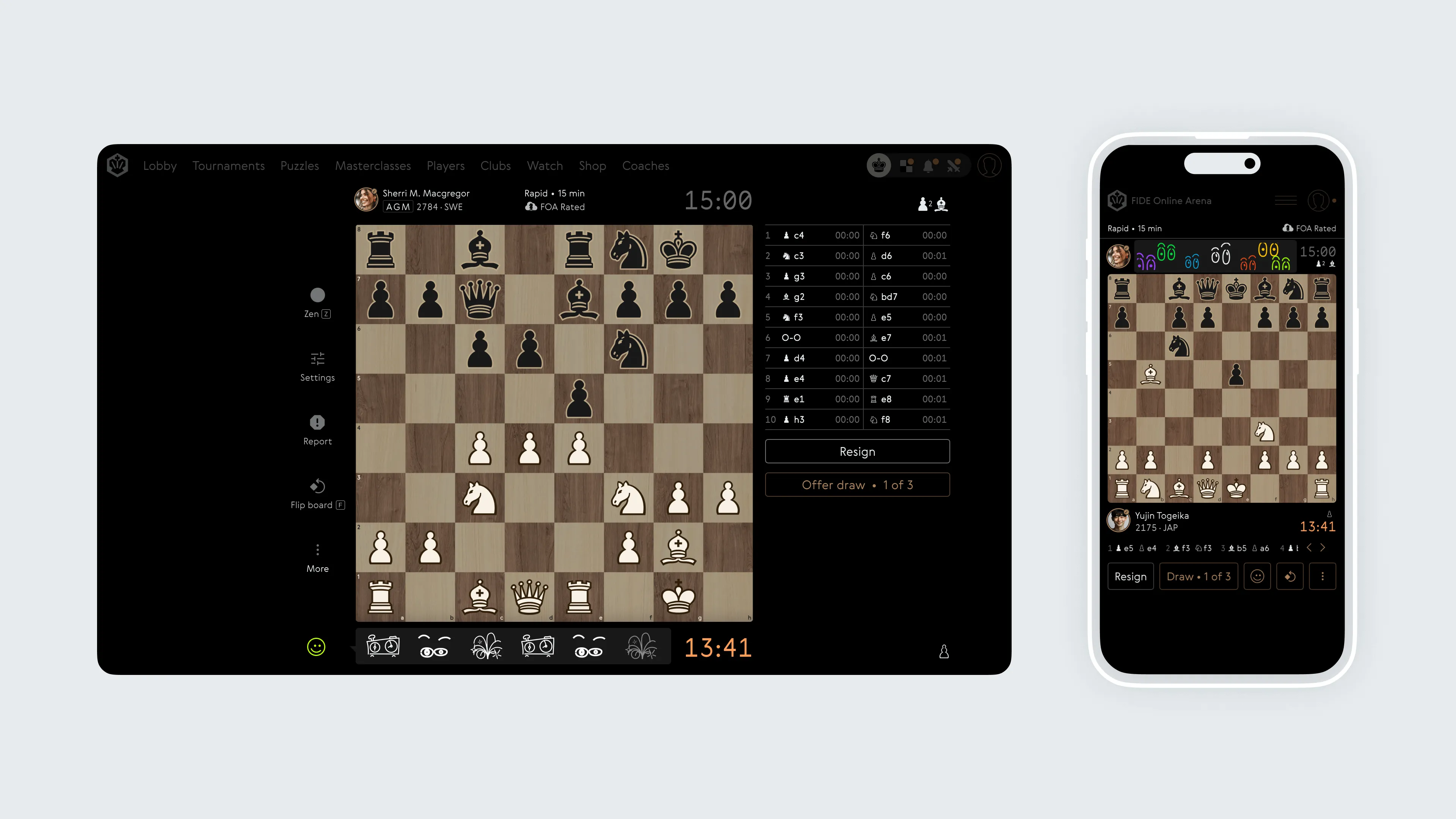
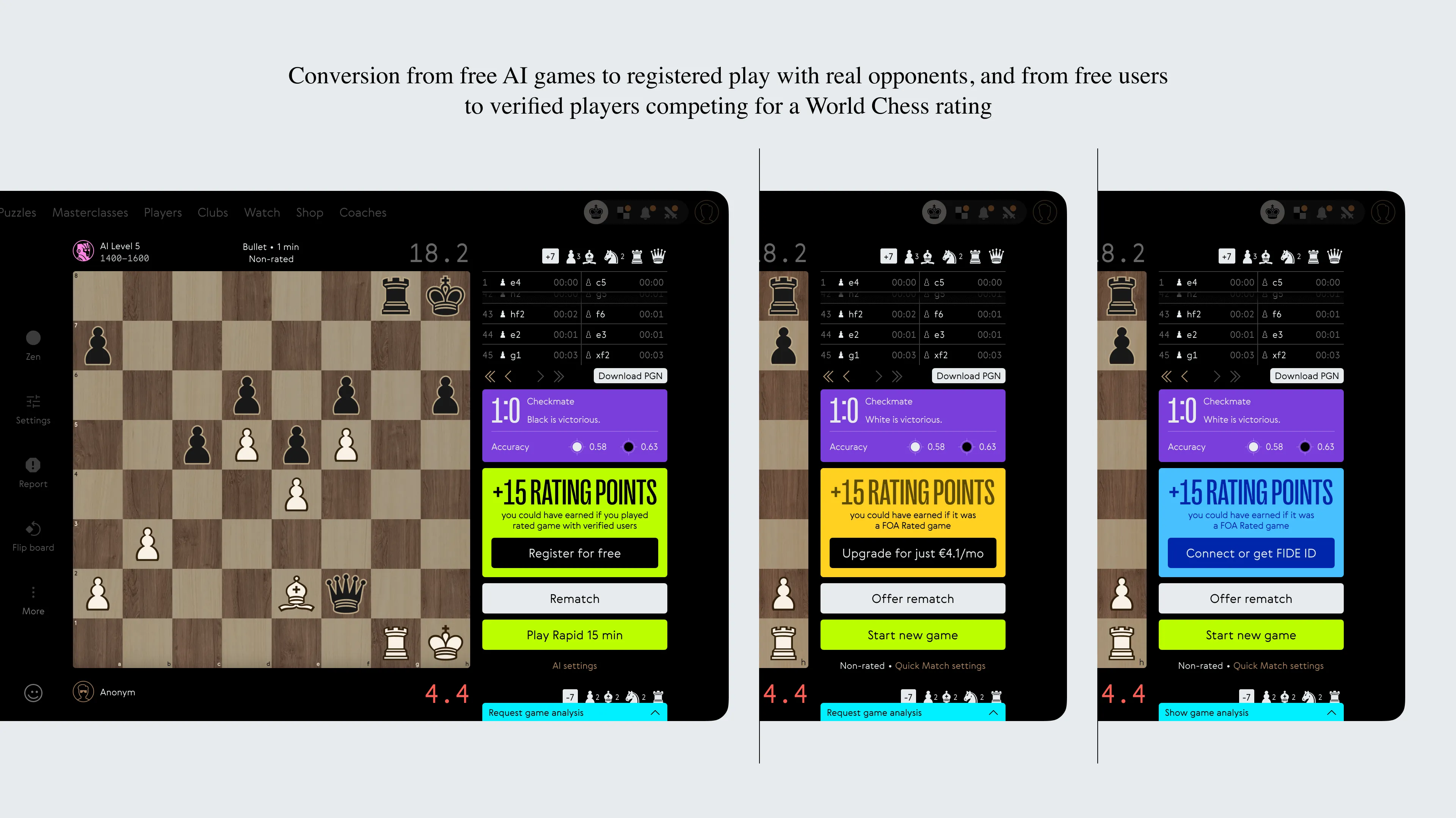
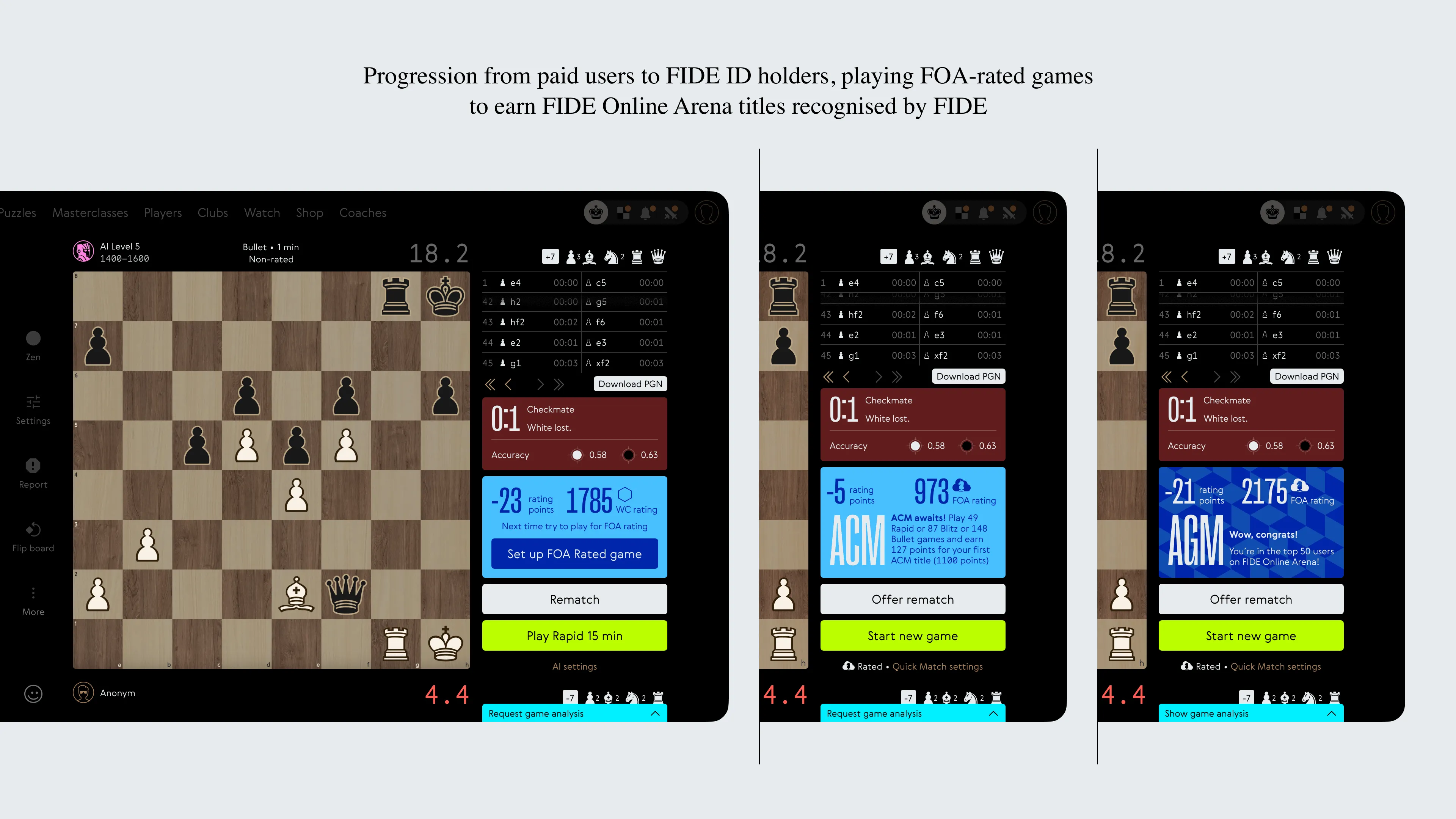
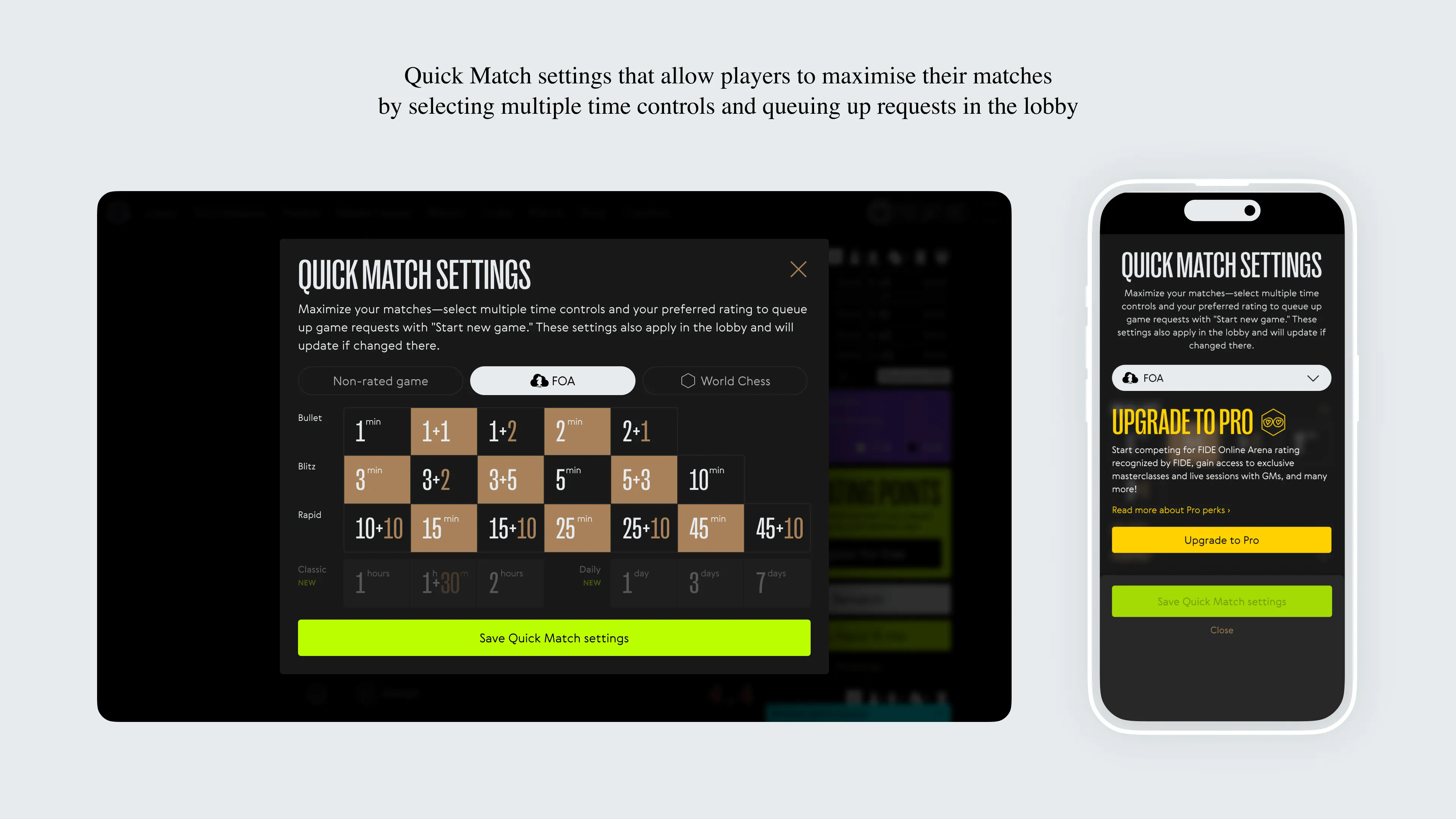
When I started on this second version of the chess interface, the mission was clear—make it look sharp, feel intuitive, and get more people playing. First, we had to roll out the new branding and colour coding, but beyond that, the big challenge was boosting conversion rates. We wanted to nudge anonymous players into signing up, turn free users into paid ones, and then lead them to get a FIDE Online Arena rating. It was all about making that progression feel natural and rewarding.
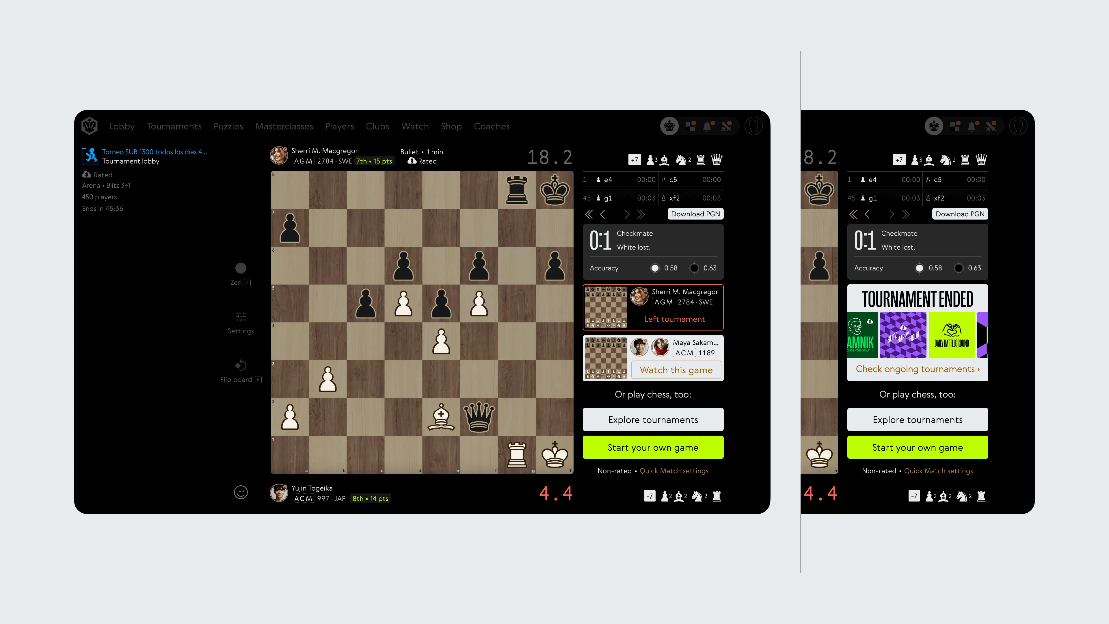
One of the standout additions was in-game reactions (drawn and animated by Dima Vinogradoph from my description). Nobody in the online chess world had done it before, and it added a whole new layer of engagement. Then there was the viewer mode—this wasn’t just a passive experience anymore. We gave spectators more options, like offering them other games to watch right when their current one ended, which was meant to be a big hit for tournaments.
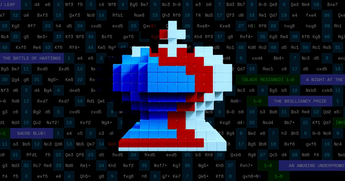
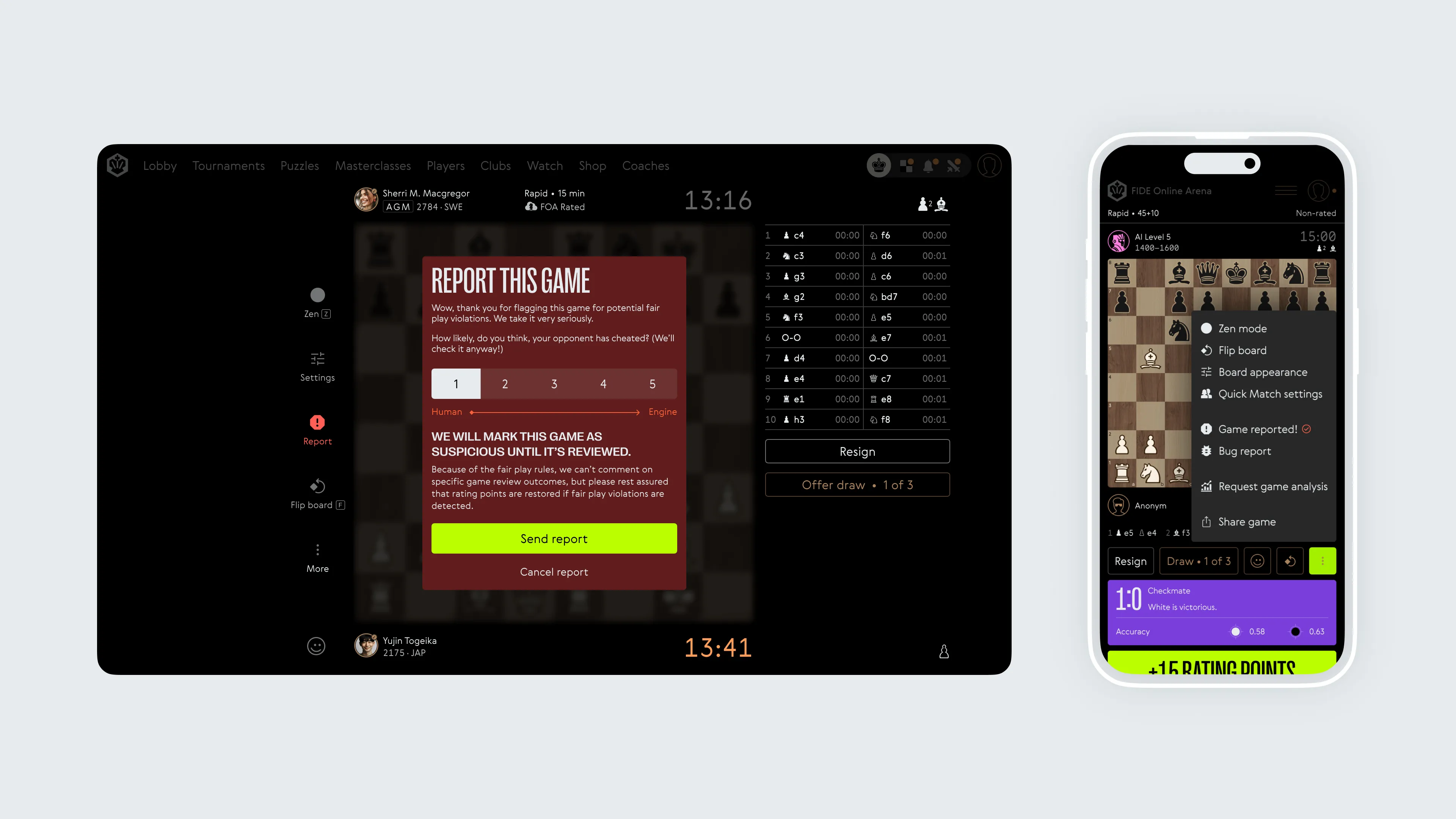
I also tackled the game report system, making it more straightforward. Now, when a game is reported, users know exactly what happens next, and we even added a new ‘reported’ state. On top of that, I rearranged the quick access buttons, putting ‘Resign’ in the top spot since it’s the most popular choice, and made sure all the icons felt consistent. The dropdown and mobile menus got a makeover too—everything flows more smoothly now.

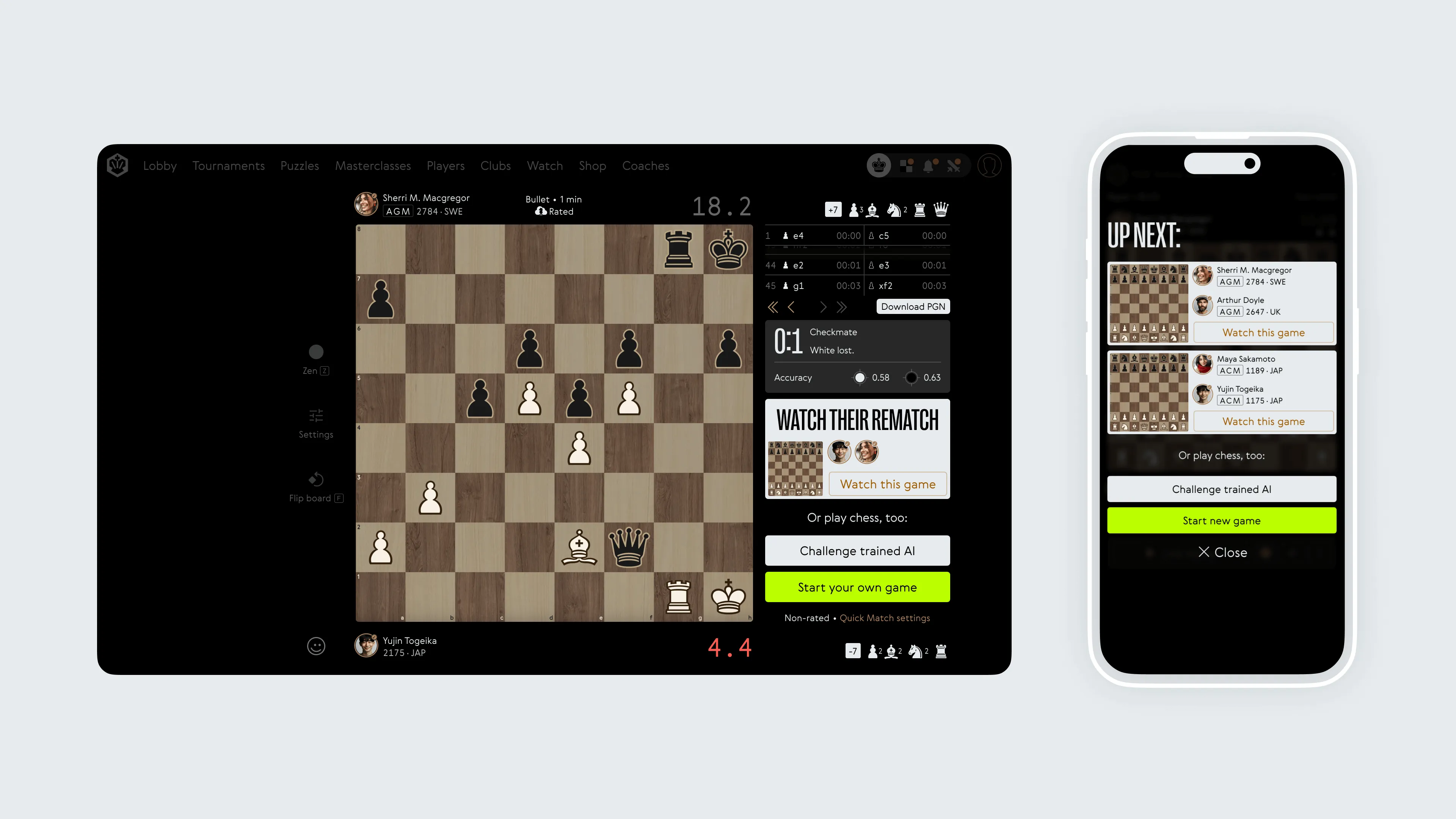
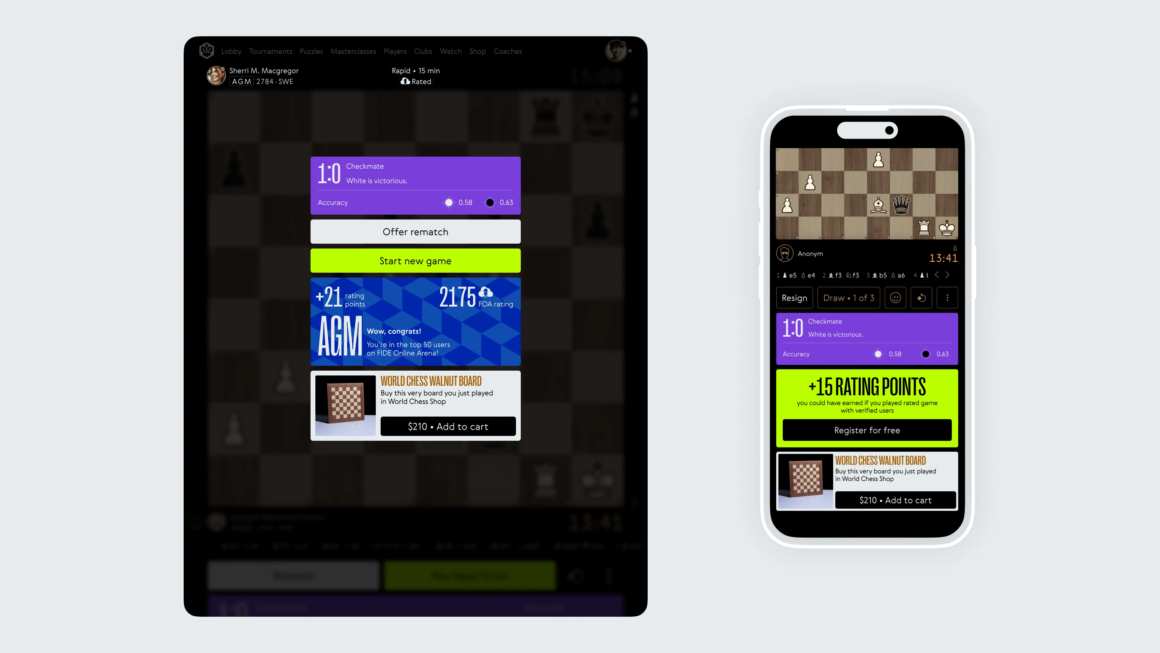
At the end of each game, we introduced an upsell feature, where players are given an opportunity to buy the board design they’ve been playing on as a physical product from the World Chess Shop, or be offered a discount or another promotional opportunity. This upsell was integrated as part of the final banner, blending seamlessly with the game’s progression, while providing multi-modal engagement opportunities for the players.
And while the design wasn’t planned to mimic Mark Rothko’s style, it ended up with a similar vibe. Those colourful banners at the end of each game weren’t just for show—they guided users to what we wanted them to do next, whether that was registering, playing a game against paid verified users, going for the all-important FIDE Online Arena rating, or exploring the World Chess Shop offerings.
Please note: While I designed the layouts and user scenarios for this project, the board, pieces, and some UI elements were created by previous subcontractors. Additionally, the real interface remains similar but still reflects an earlier version, which I also designed. Since then, some choices have been made, and I respect those decisions.
Photo of a boy sitting in front of Mark Rothko's Green, Red, Blue (1955) by Michael Newman