The redesign of FIDE Online Arena’s front page was a step-by-step process influenced by the platform’s broader rebranding efforts. With each new feature and design iteration, the goal was to streamline the user experience, modernise the visual appeal, and align with the evolving brand identity.
Through close collaboration, the redesign introduced exciting new sections like chess puzzles, tournaments, and masterclasses. Ultimately, the project was well-received by users, but there are lessons to reflect on, particularly when it comes to balancing internal and external feedback.
• Front page redesign
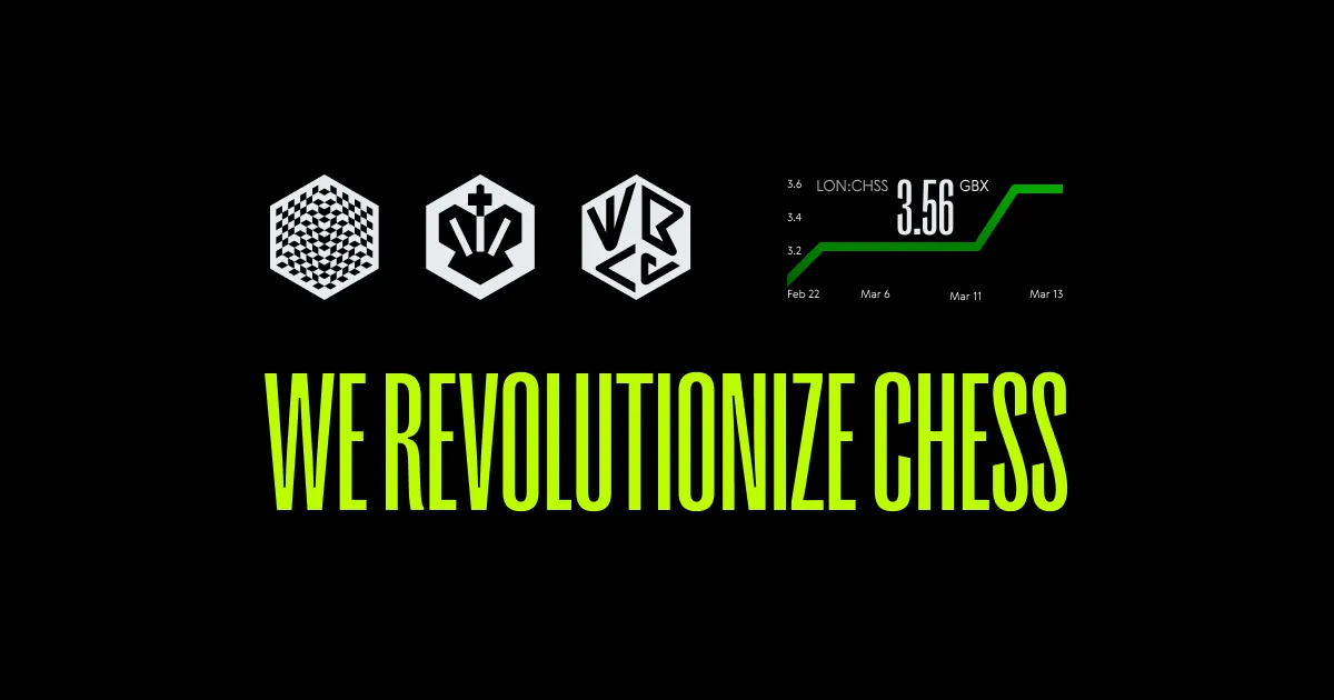
• Rebranding process
• User feedback in design
• Visual language evolution
• Power of prototyping
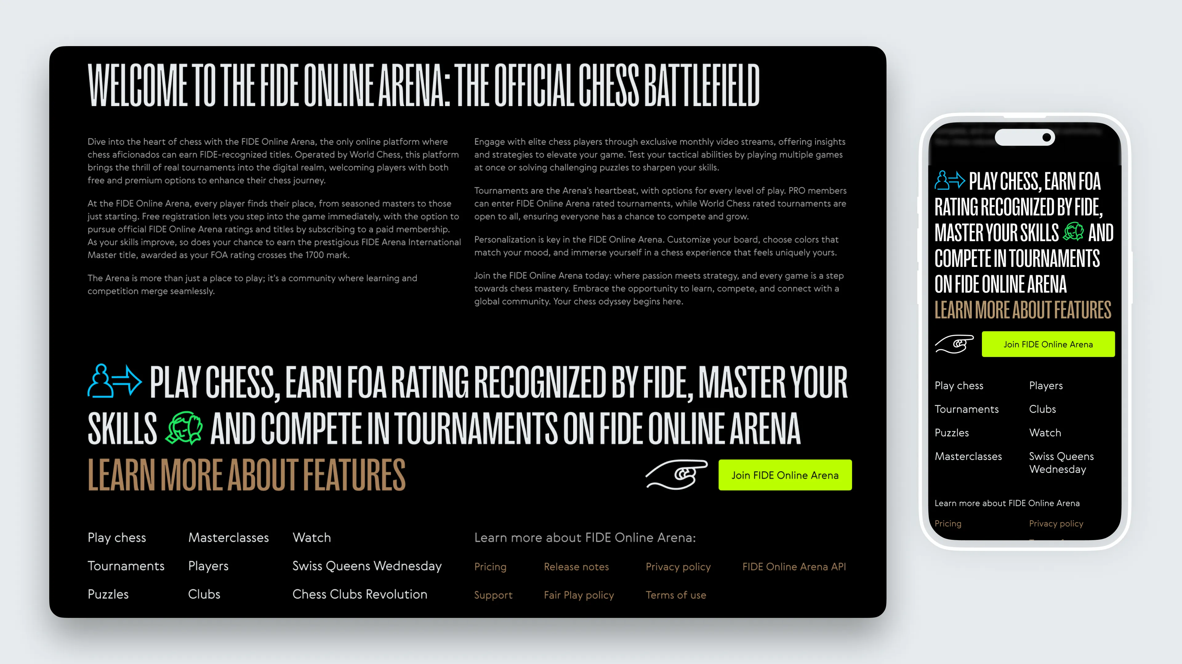
The road to the new front page of FIDE Online Arena began with wireframes and prototypes, ideating on how the structure could function. It was clear from the start that the rebranding of World Chess would play a key role, so instead of rushing into the design, I worked on conceptual ideas while waiting for the visual assets to be finalised. With the CEO involved at every stage, we gradually introduced new elements to the page.
Just above, you’ll find the promo video we created to highlight this particular update. We produced it for the marketing department with the help of Mike Melnikov, World Chess in-house graphic designer, who crafted the storyboard and all the keyframes. Dima Vinogradoph brought the animation to life, and together we selected the jazzy, stylish music that perfectly complements the vibe. The video is narrated by the amazing Jesse February.
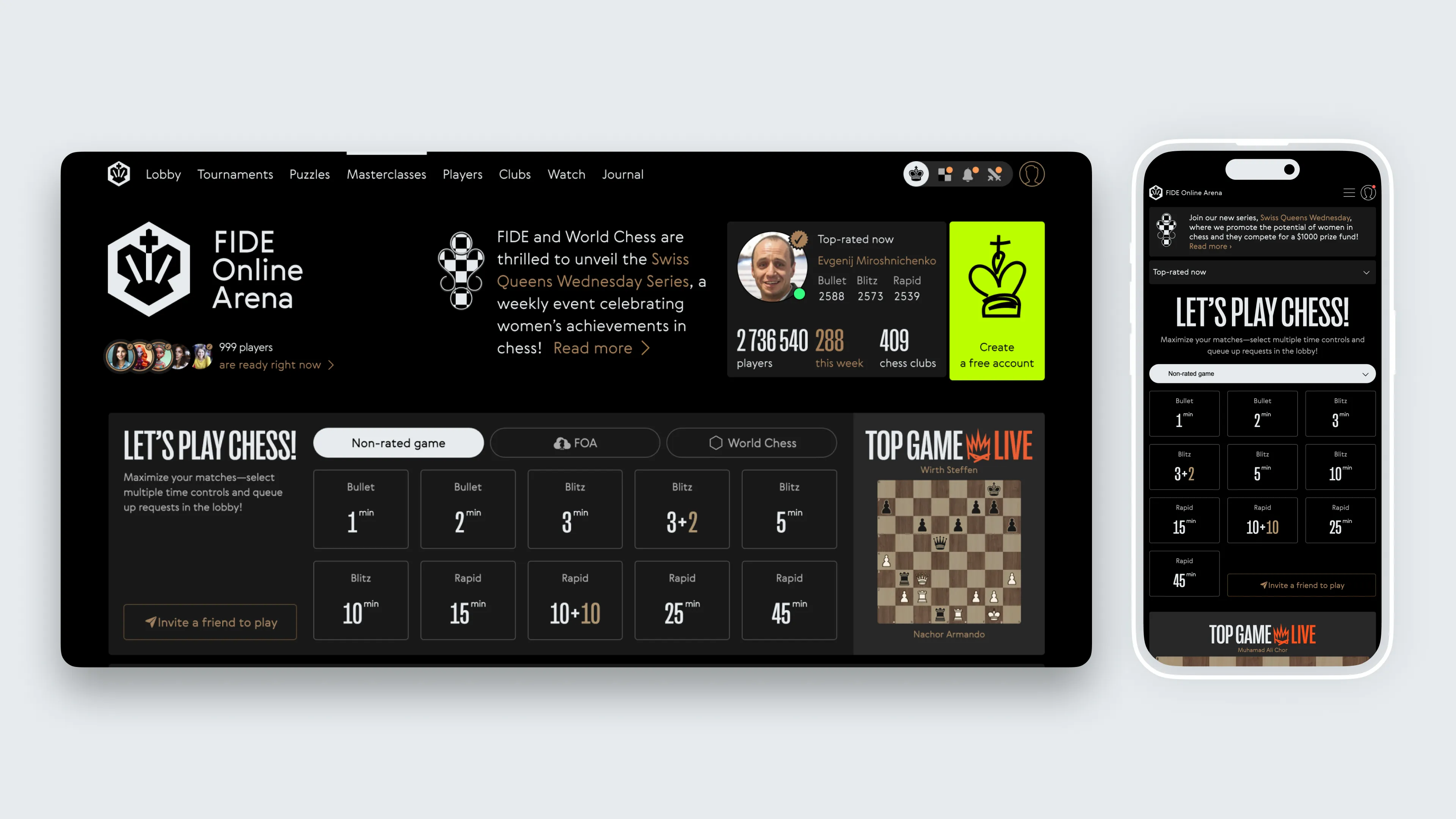
Clearer game launch elements
We added a multi-request function, allowing users to launch multiple game requests with different time controls, which maximised their chances of finding an opponent.
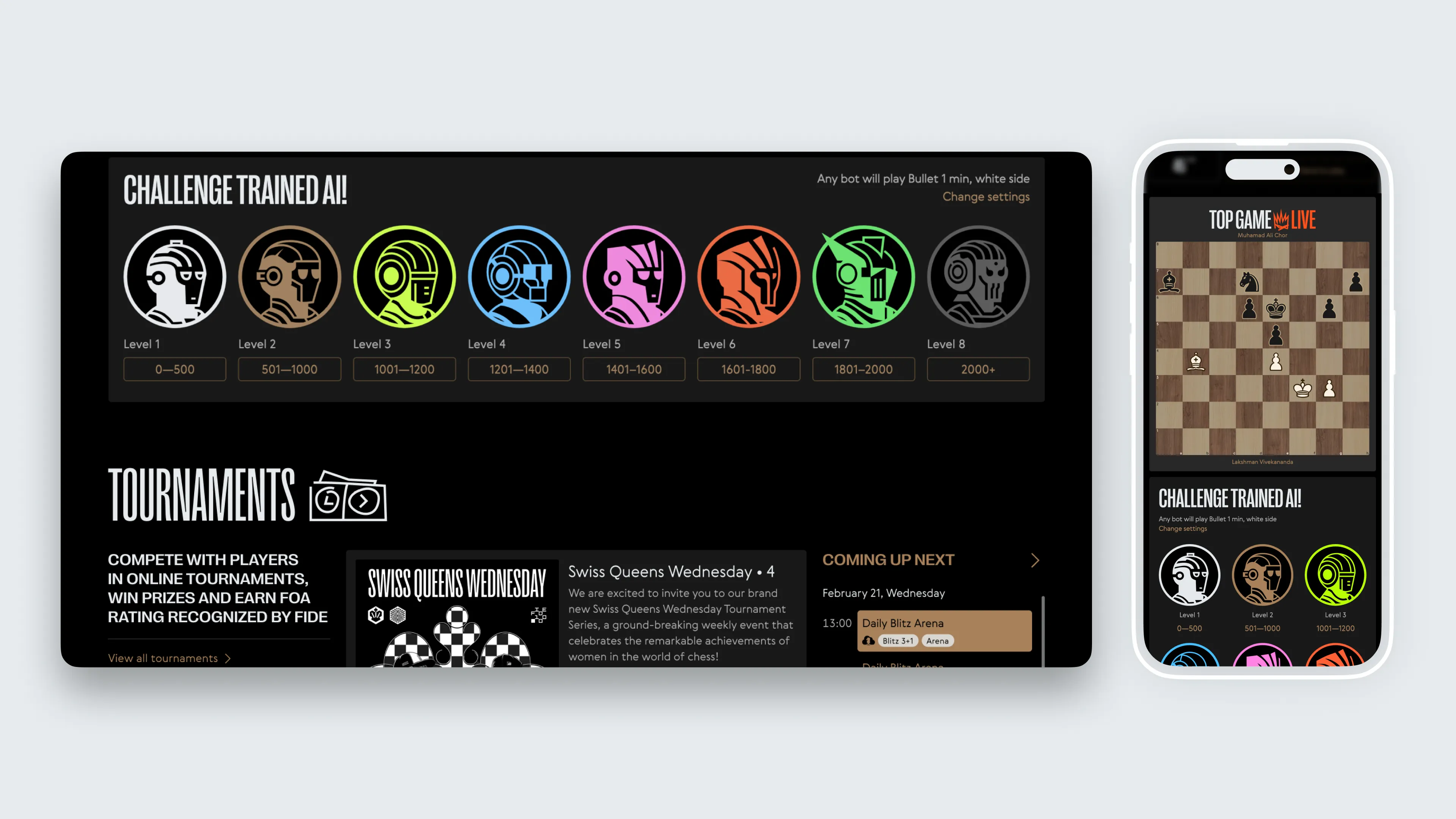
Bot game redesign
Introducing multiple bot levels and laying the groundwork for potential bot personas in the future.
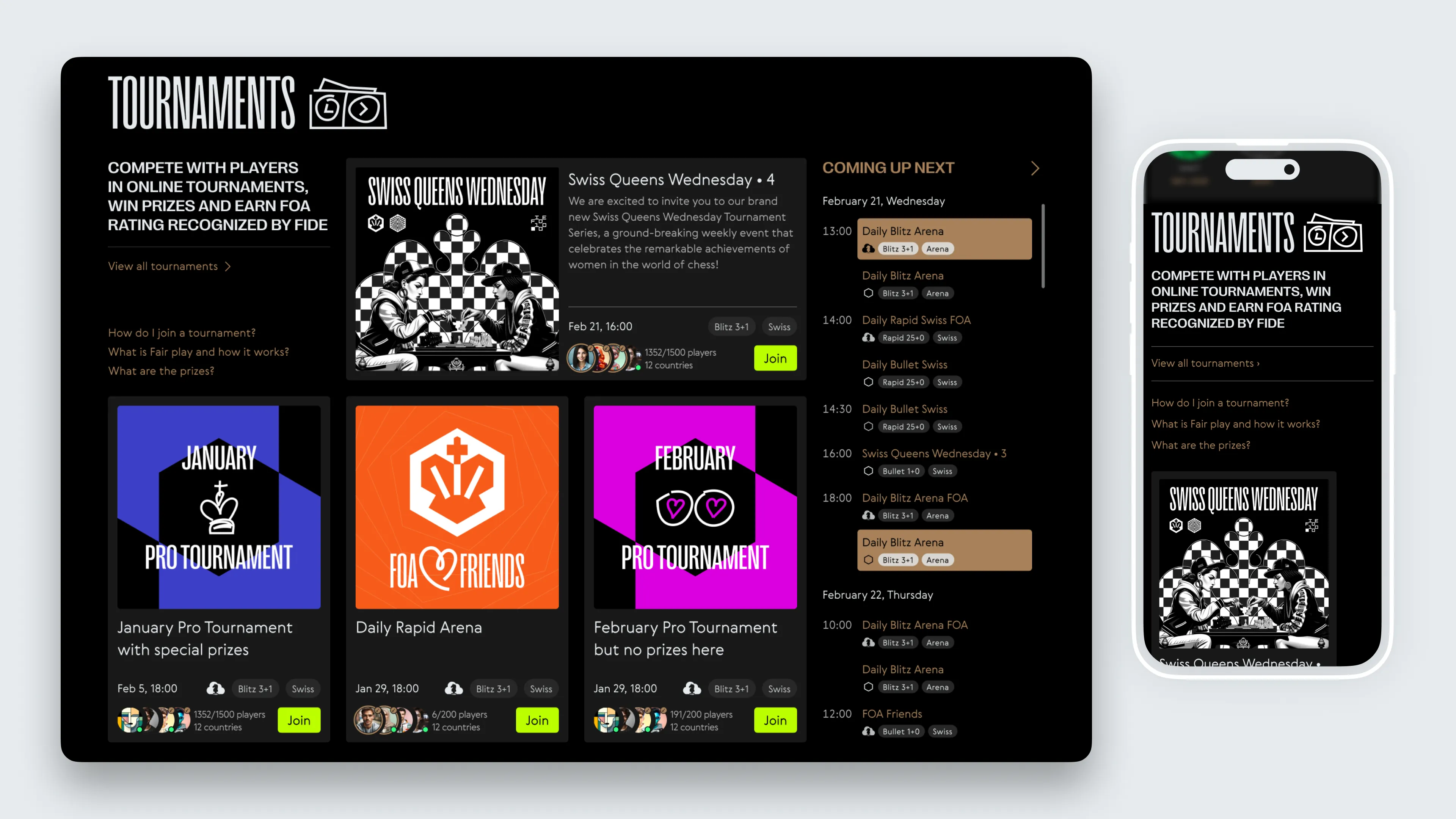
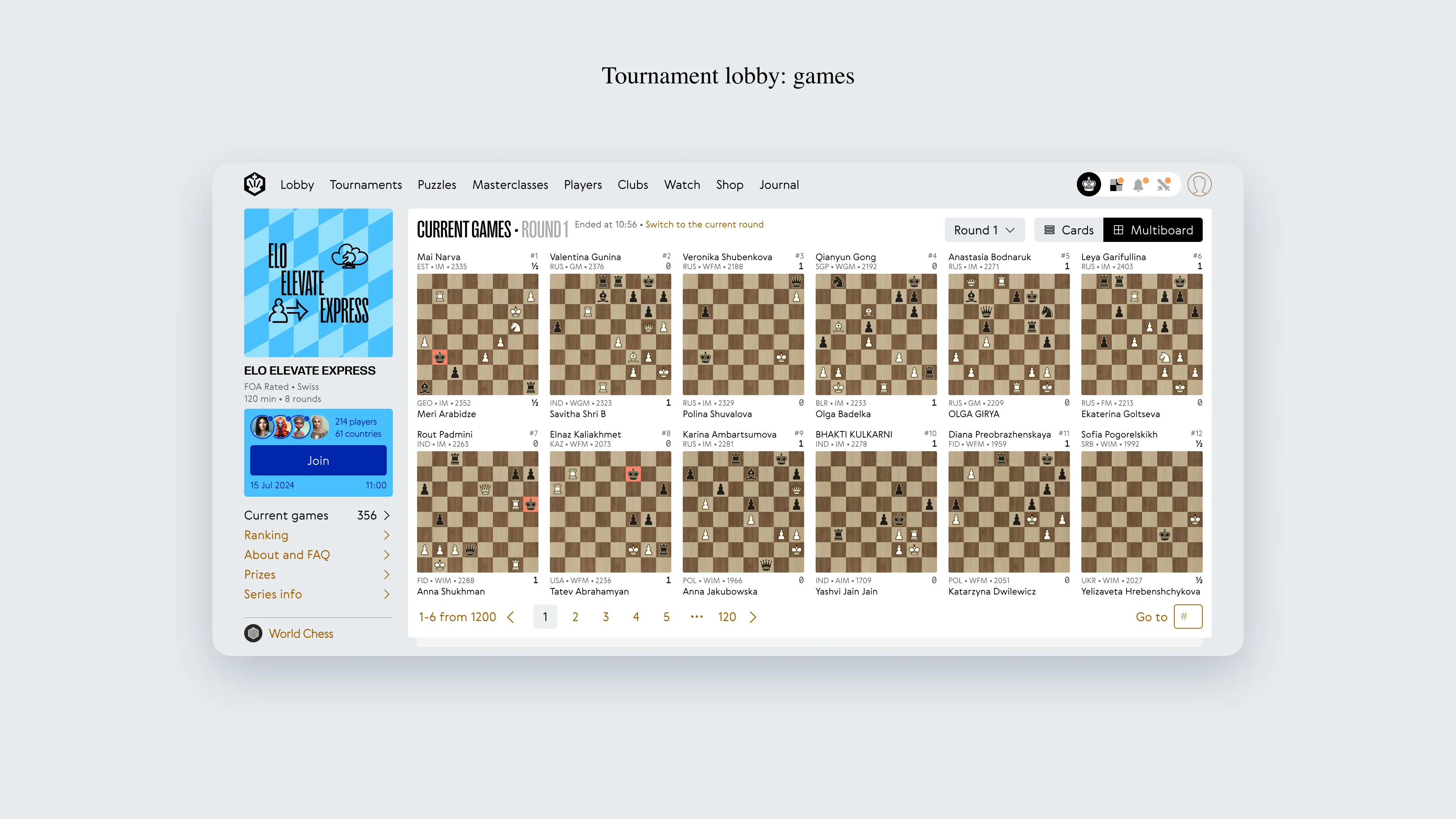
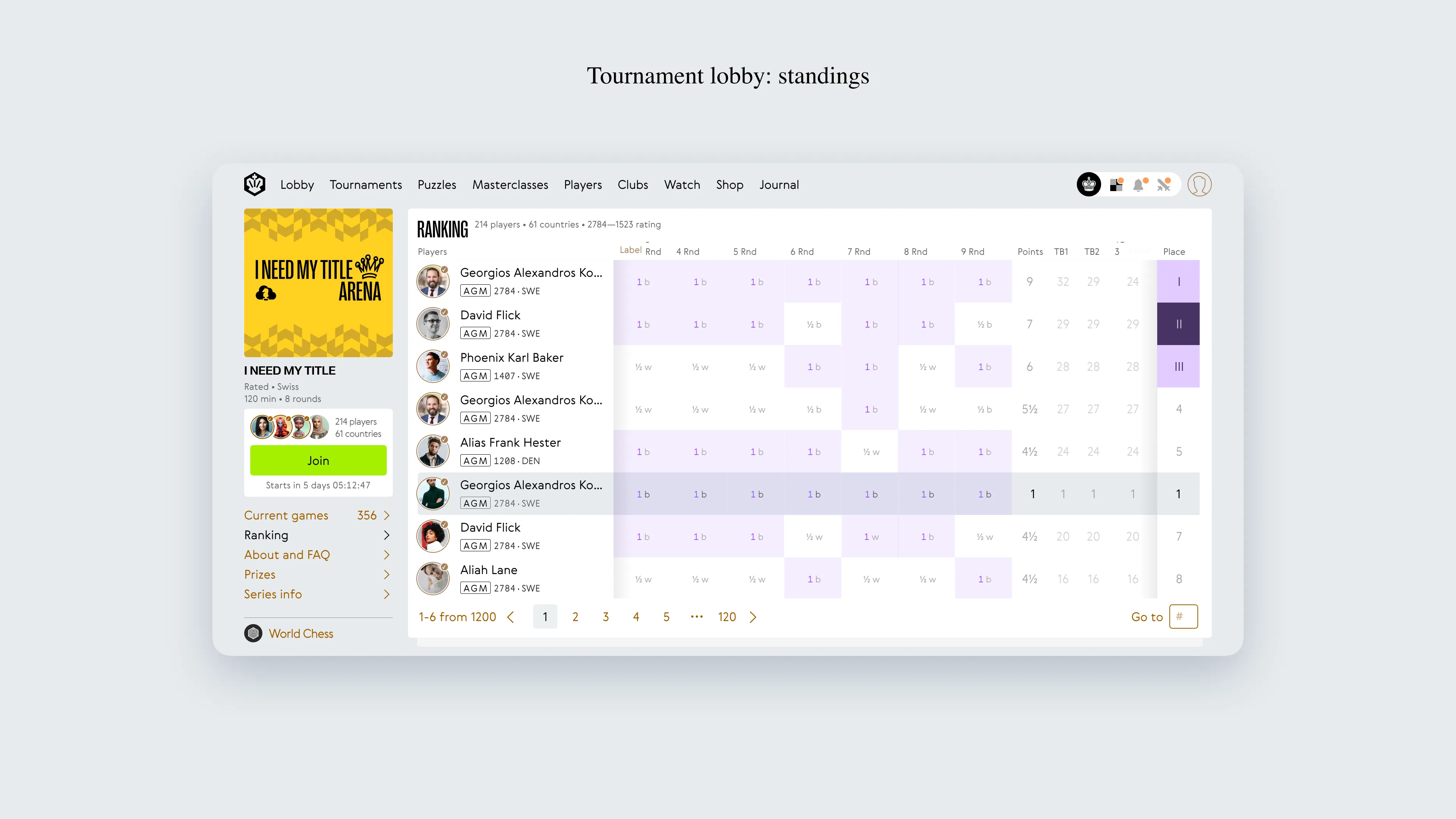
Expanded tournaments
A more dynamic tournament schedule with greater visibility.
Masterclass section
Showcasing high-quality educational content, a key part of FIDE Online Arena’s offering.
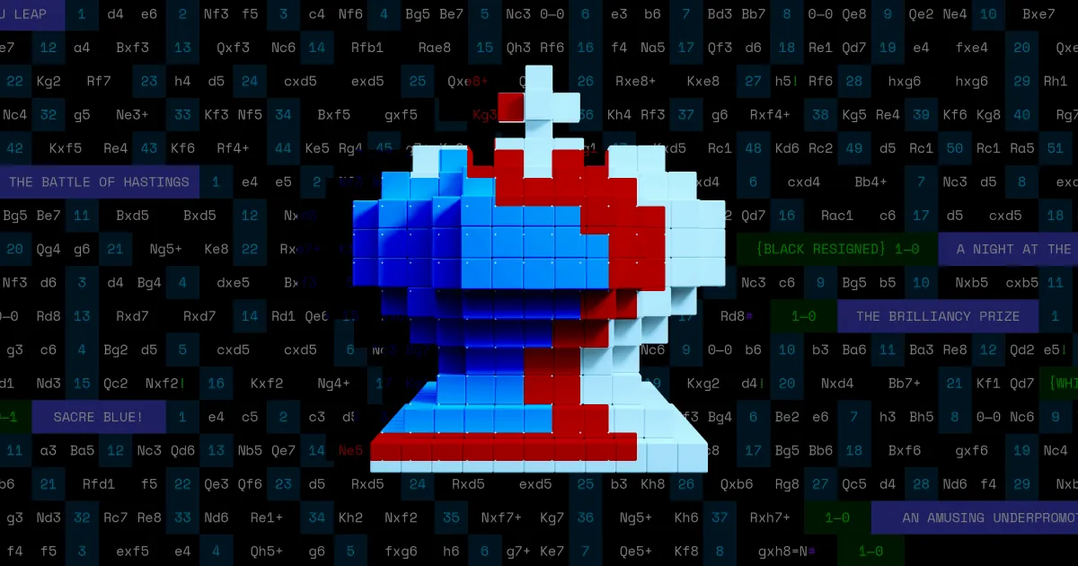
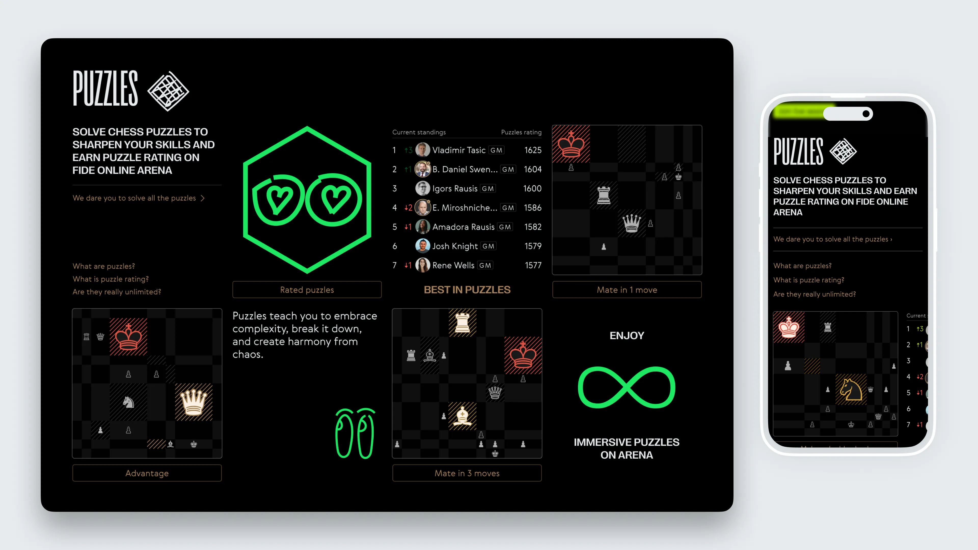
Chess puzzles section
Introducing different puzzle categories and a separate rating system for players.
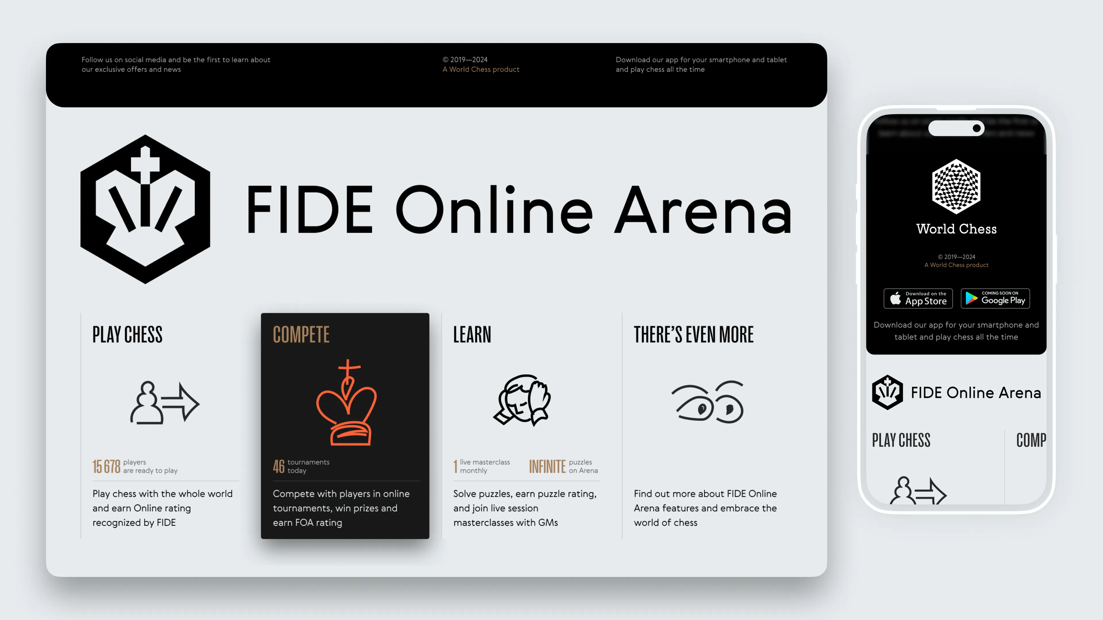
From the feedback gathered, it was clear that users appreciated the cleaner and more feature-rich design. For example, 44.2% of users rated the new design as "Good" and 32.1% as "Excellent," particularly noting the improvements in game launch functionality and navigation.

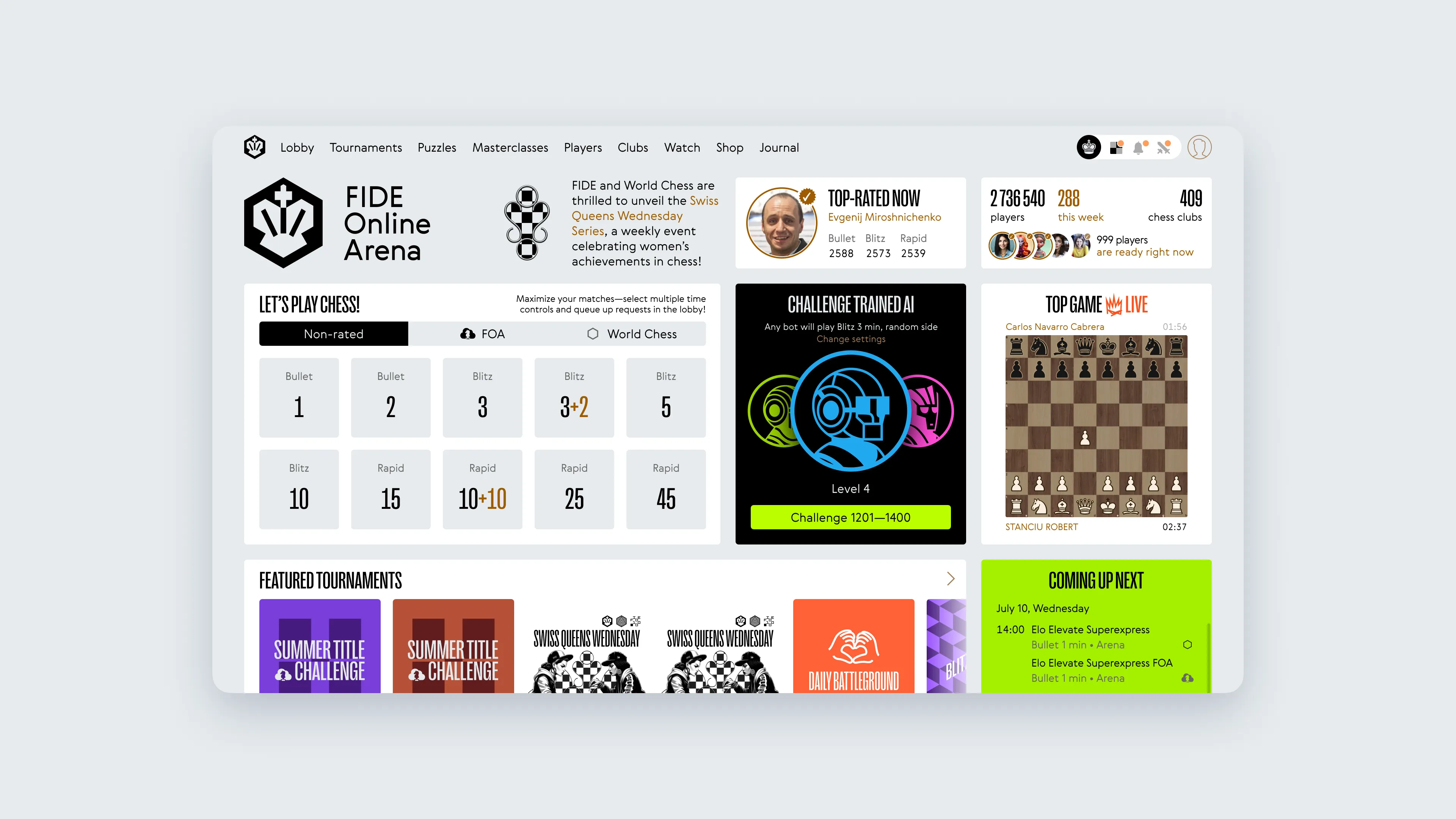
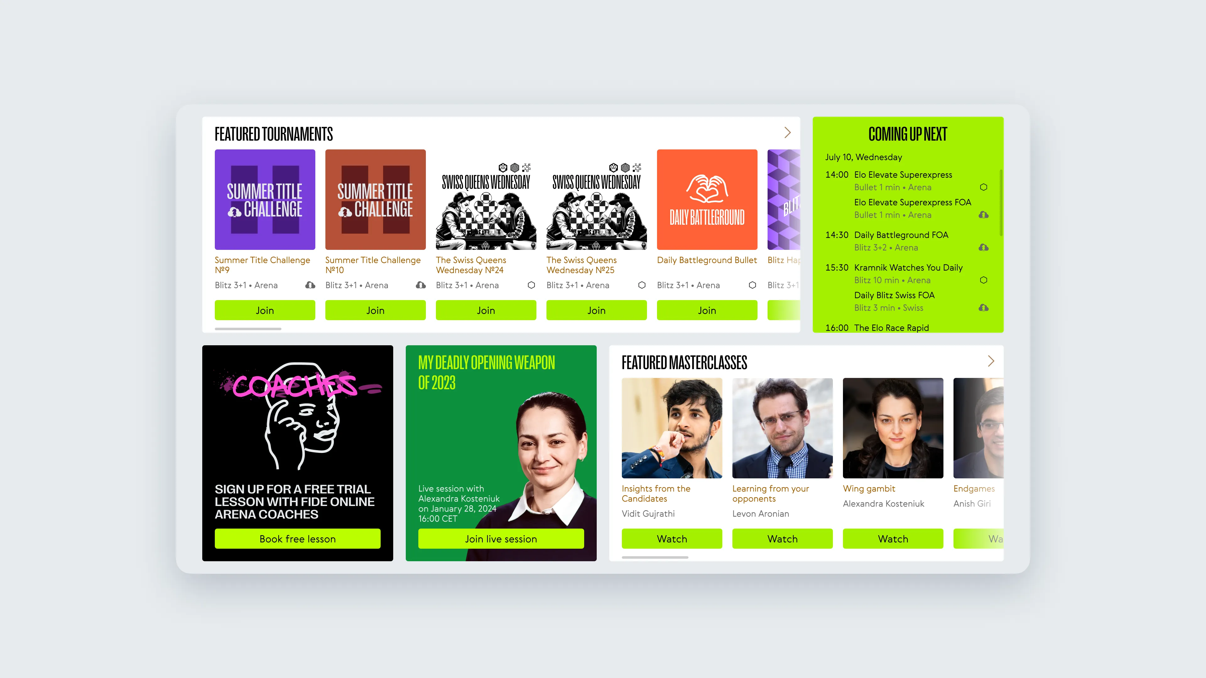
The front page redesign was met with favourable responses, but we didn’t stop there. As the rebranding solidified, we transitioned to a second version of the design that aligned more closely with our vision of an evolving visual language, embracing a modular, bento-style approach. This language started to take shape with the updated game interface and continued into the front page and thee tournament lobby. By adapting the visual elements for digital media, we demonstrated how the platform could maintain its identity across different touchpoints.
While user feedback continued to be positive, and the CEO remained involved, there were differing views on the final direction. Without going into too many details, it’s safe to say that not every decision aligned perfectly with every stakeholder's vision.

This particular project highlighted important lessons on how to handle front page redesigns, especially during a major rebranding. Here are some key takeaways:
Keep stakeholders engaged, but manage expectations
The CEO was involved at every stage, but final feedback still shifted. Regular involvement is key, but anticipate that stakeholders’ preferences may evolve, especially during rebranding.
Evolve the visual language in sync with the brand
As the second version of the design showed, integrating rebranding elements from the game interface allowed for a more cohesive experience across the platform. Use early design iterations to develop a visual language that scales.
Prioritise clear navigation over complexity
With multiple new features (like puzzles, tournaments, and masterclasses), focus on usability. Users should be able to access everything easily without feeling overwhelmed by too much content.
Leave room for growth
Scalability was crucial in this redesign. The new design left room for future enhancements, like adding more personalised bot personas or additional tournament options, without needing another complete overhaul.
Don’t rush a design without final assets
It was essential to wait for the rebranding elements to be finalised before diving fully into design. Starting too soon could lead to misaligned visuals or wasted effort.
Don’t overlook internal feedback but stay adaptable
While the CEO’s feedback didn’t fully align with the final design, their involvement helped steer the project early on. Balancing internal perspectives with external user feedback is crucial.
Don’t overcomplicate the design
Some user comments mentioned that competing platforms felt “busy” or “cluttered.” Keep the focus on usability and simplicity, even when integrating new features.
Don’t let personal biases hinder progress
Whether it’s CEO preferences or designer instincts, balance is key. Make decisions that align with the company’s vision and user experience, but be open to course corrections when needed.
Don’t lose sight of the bigger picture
While focusing on specific page elements, always keep in mind how the overall platform is evolving, particularly when working during a larger rebranding effort.