The FIDE Online Arena branding project aimed to transform a fragmented visual identity into a cohesive, modern system, but it wasn’t without its challenges. While the goal was to create a design that worked both online and offline, and remained true to chess’s traditions with a modernist twist, early misalignment with stakeholders led to some missteps.
Despite these challenges, the final result featured innovative elements like chess notation integration, pixel-based visuals, and a subtle commentary on human vs AI precision. Through this process, I learned valuable lessons about aligning creative vision with stakeholder expectations, which has shaped how I approach projects moving forward.
• FIDE Online Arena
• Chess branding
• Visual system design
• Modernist aesthetic
• Pixel glitch visuals
• Chess notation integration
• Educational design
• Human vs AI in chess
When I first started working on FIDE Online Arena, it was clear that the visual identity was, well, a bit of a mess. It felt like a patchwork of outdated design approaches and styles that didn’t really fit together. Or, as one can say, a vinaigrette salad—just a mix of everything. I knew right away that the brand needed a versatile, cohesive visual system, something that would work well both online and offline, while staying flexible enough for future updates.
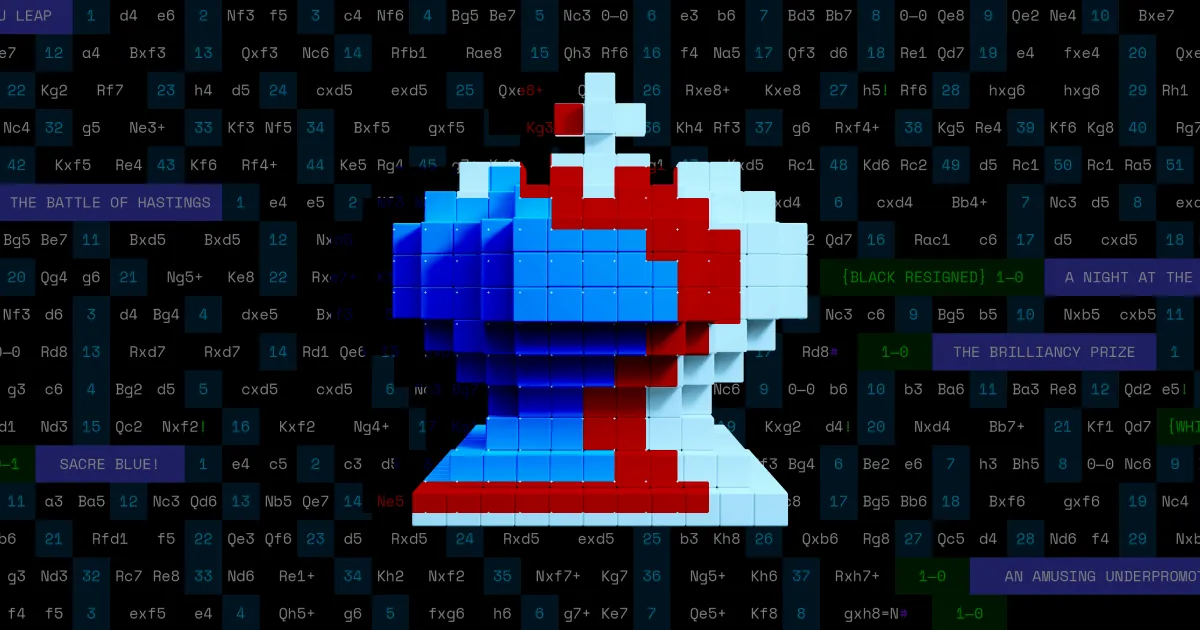
The main principle behind the new system was simplicity—everything was built around inheriting the classic square. It was a nod to both the chessboard and digital pixels, as well as the existing branding, giving the design an authentic but fresh feel. With this traditional touch, we aimed to give the age-old game of chess a new, unconventional twist, while staying grounded in a modernist aesthetic.
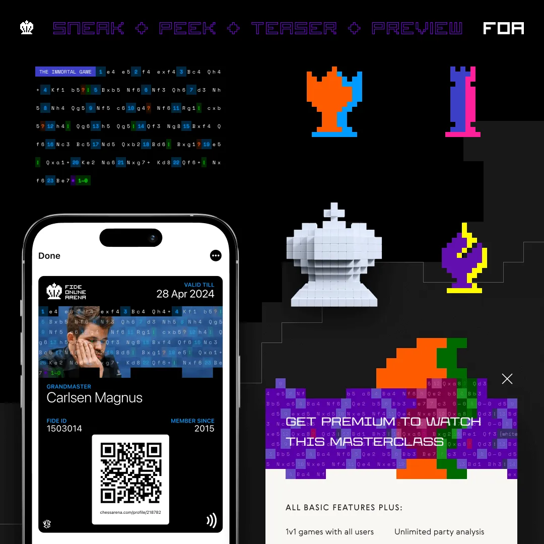
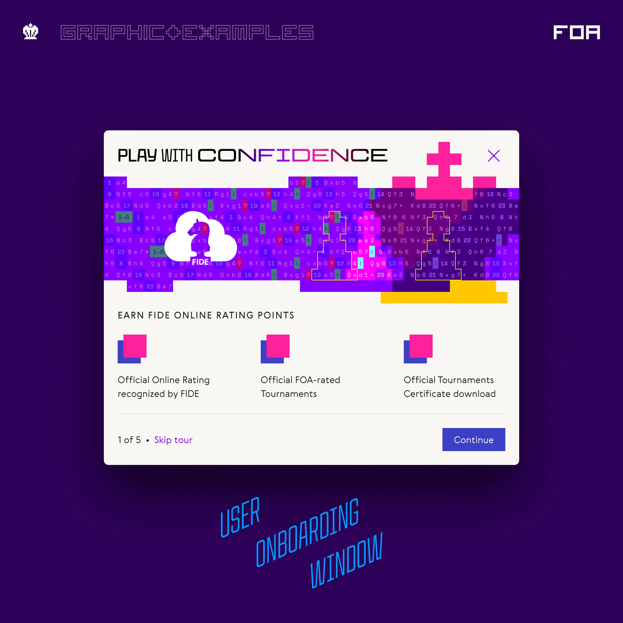
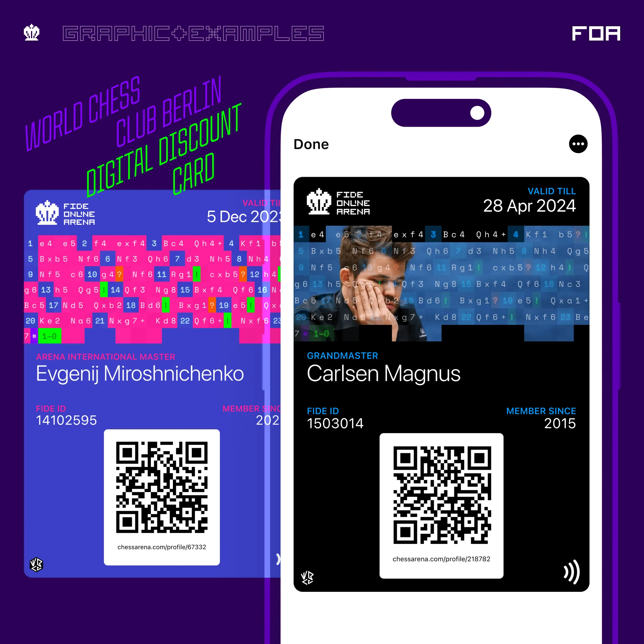
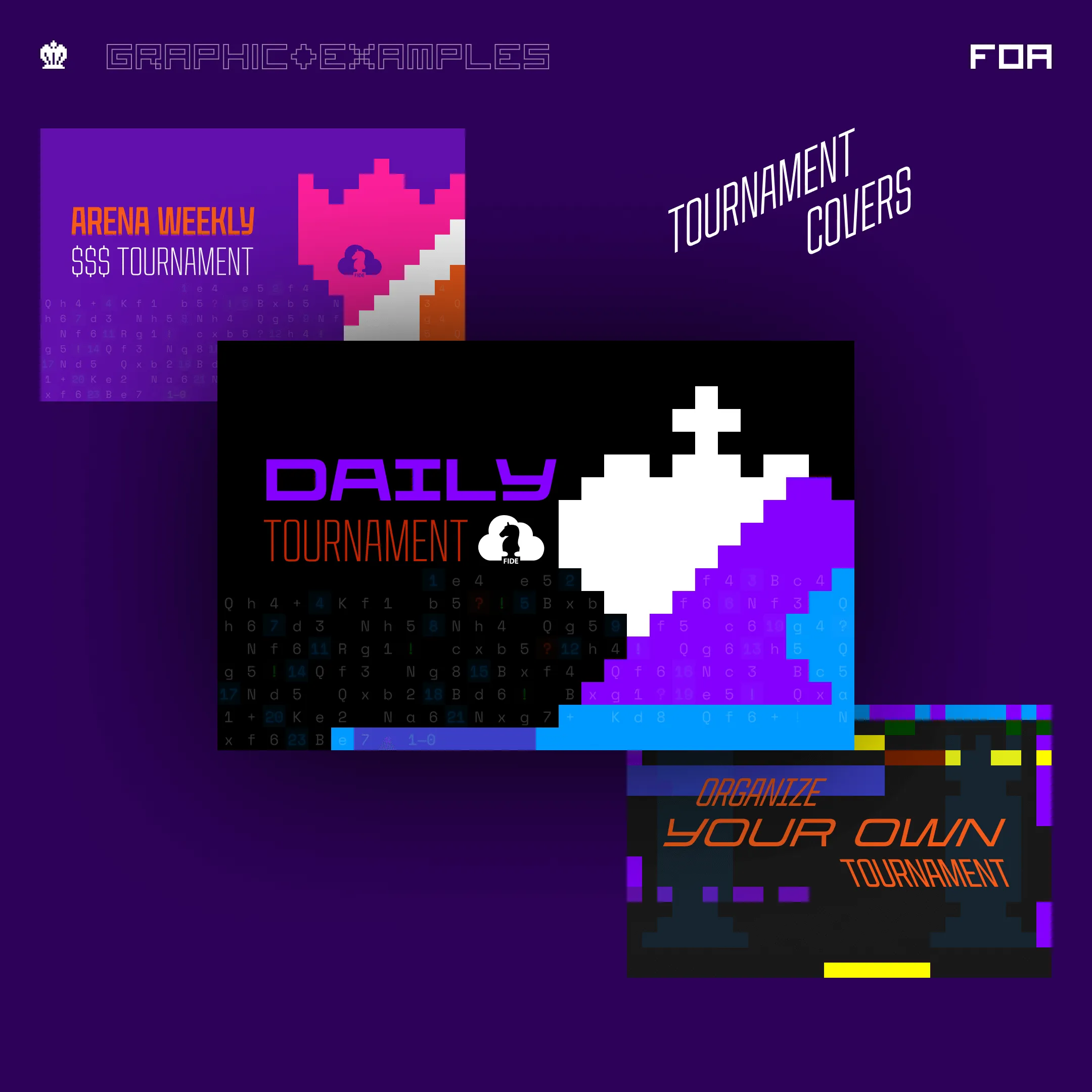
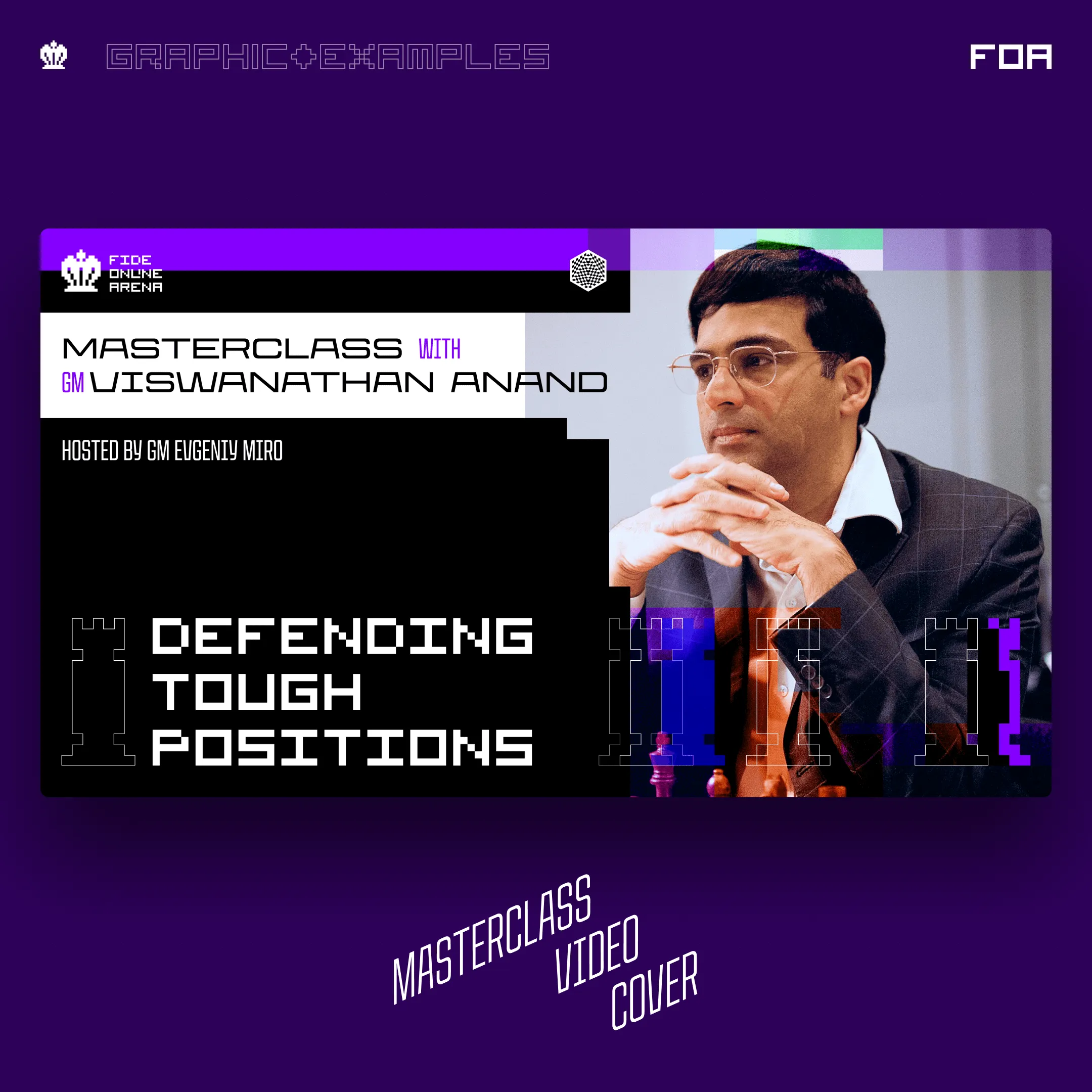
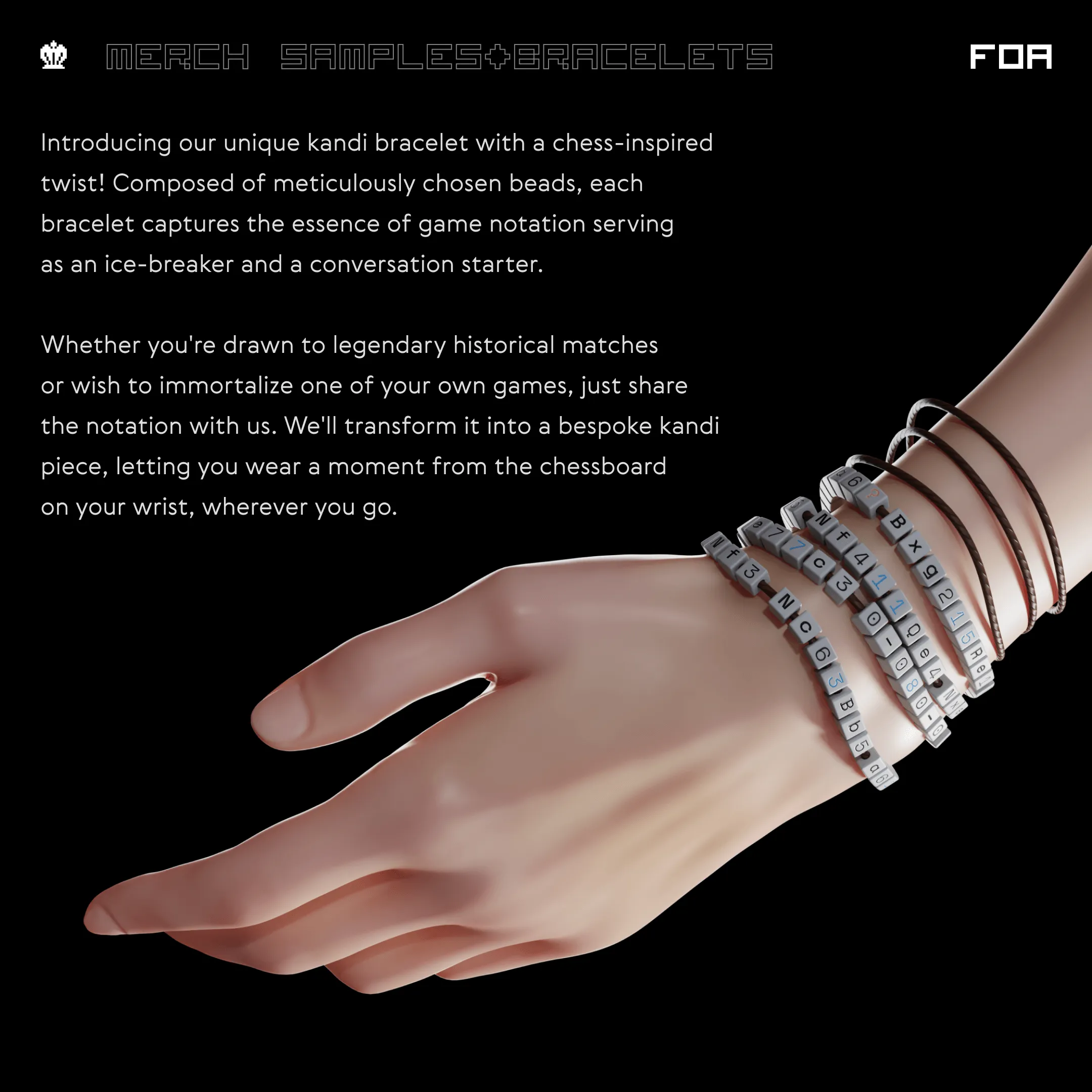
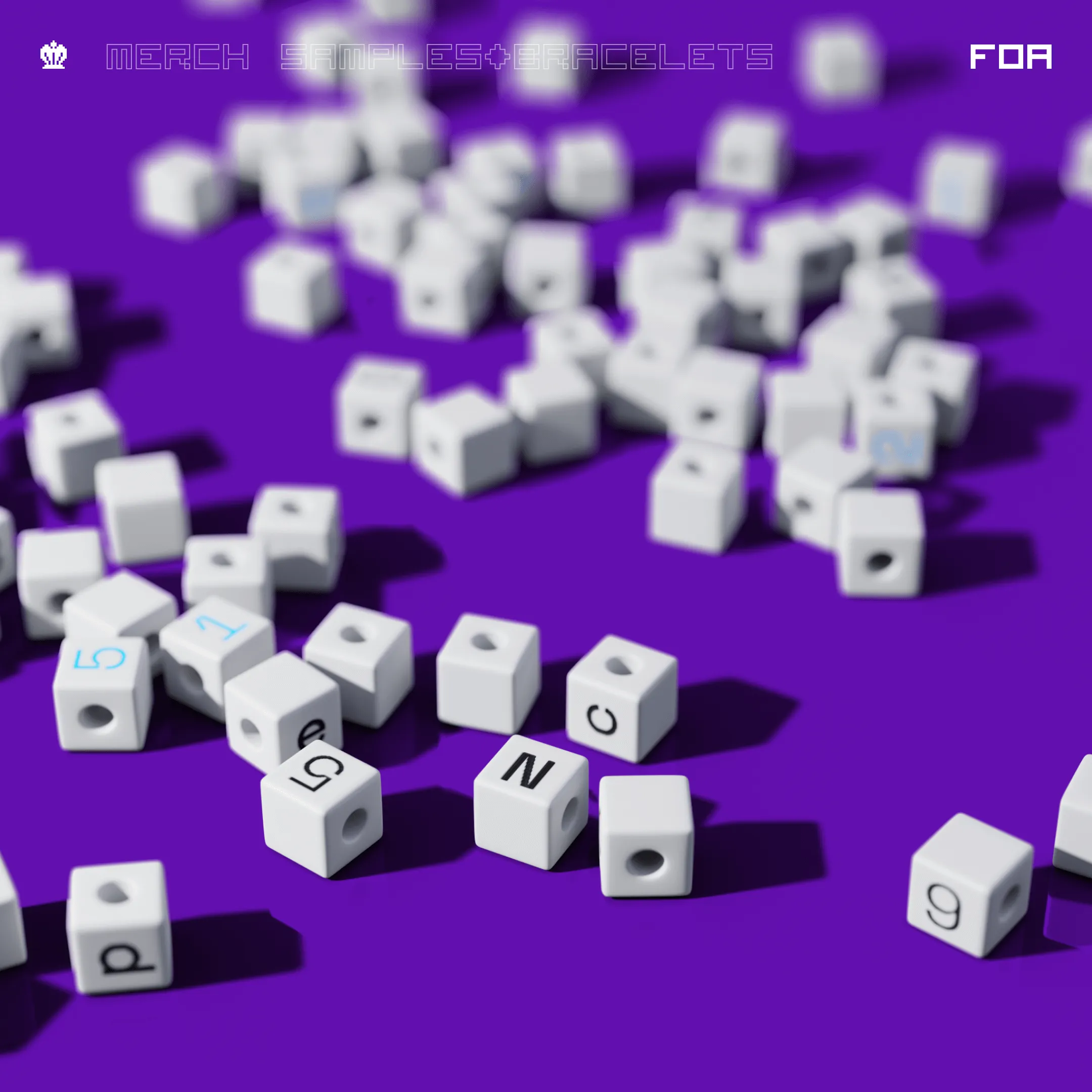
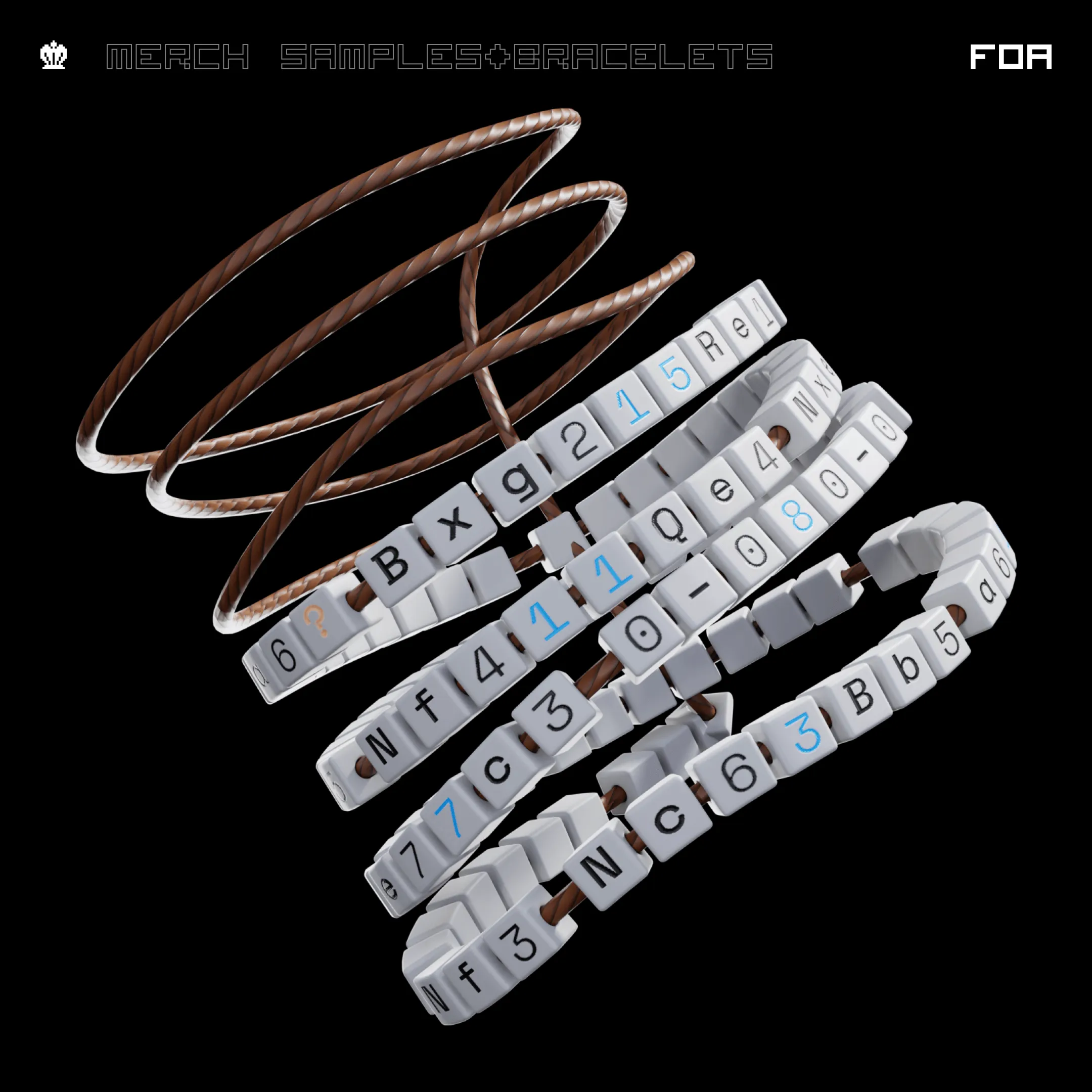
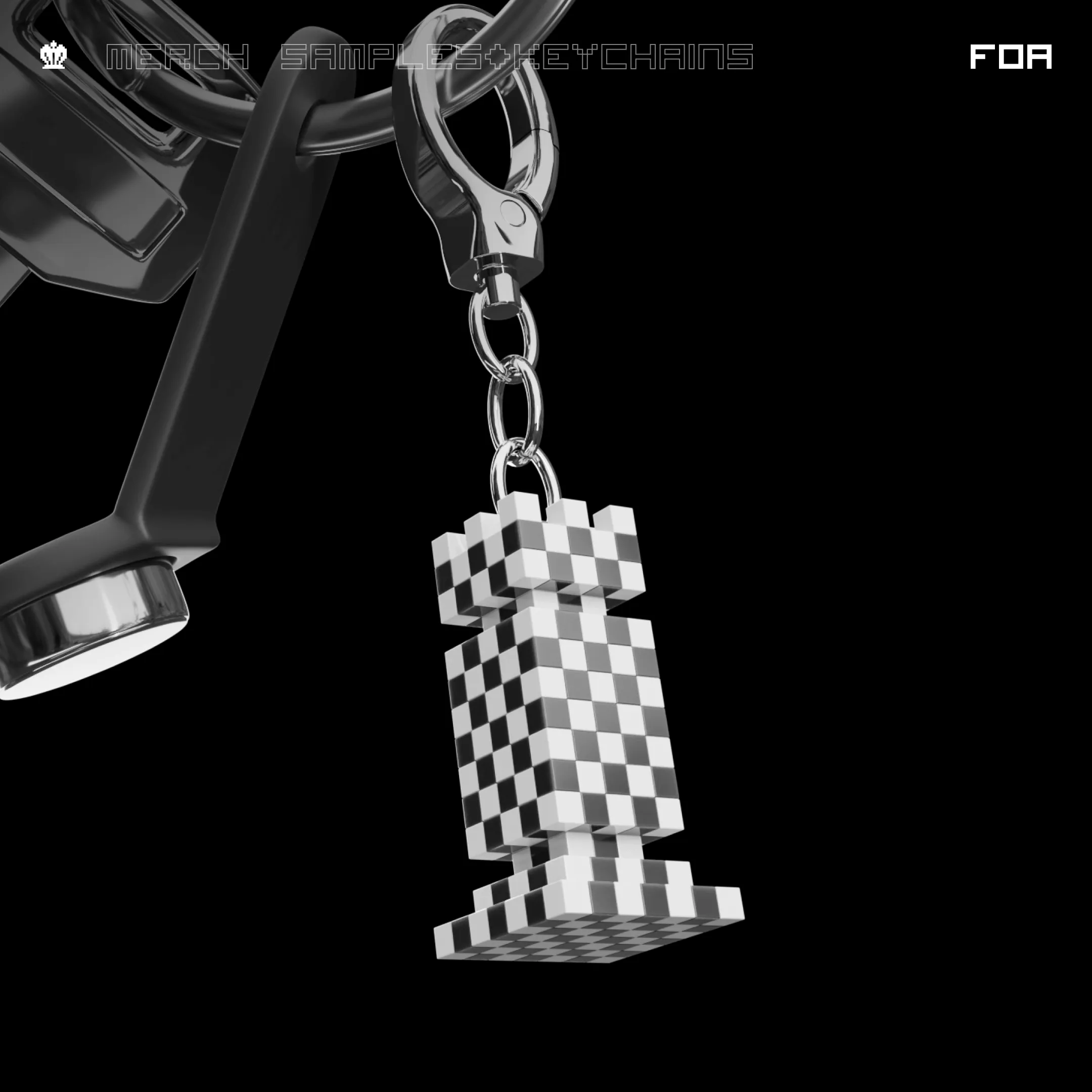
One of the key elements I introduced was redesigning the chess pieces out of these squares, embracing a pixel-inspired aesthetic. This allowed us to keep a modern look while staying true to the essence of the game. But what really set the design apart was the integration of chess notation as a design element. Not only did it serve as a visual component, but it also added an educational layer, inviting users to engage with the deeper strategy and movements of legendary games. The notation became a bridge between style and learning, giving enthusiasts the opportunity to decode iconic moves and connect with chess’s historical richness.
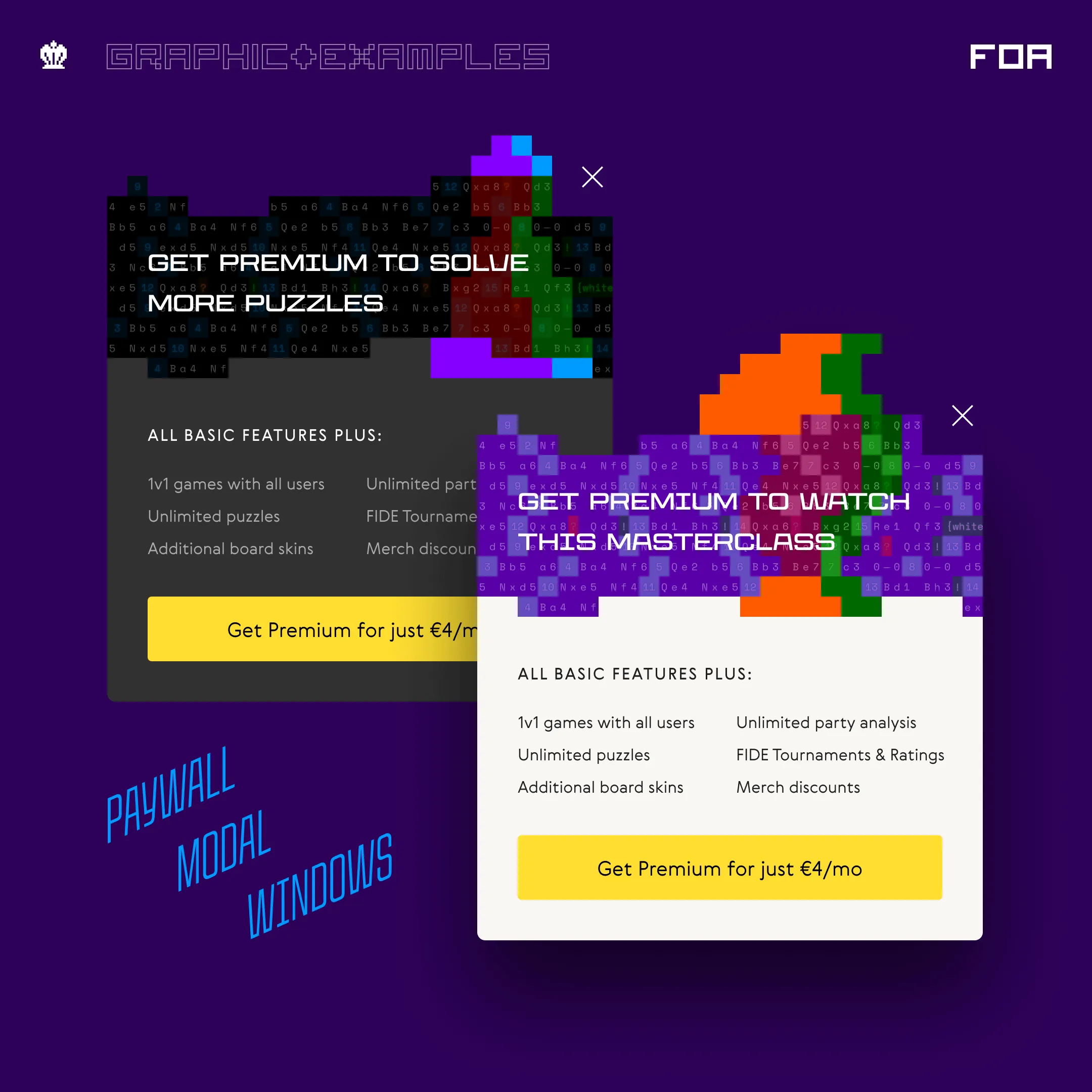
Another standout feature of the branding was the pixel glitch visuals, a sophisticated representation of the human mind’s imperfection compared to the precision of computers and AI chess bots. This subtle detail underscored the idea that while AI might be flawless, humans—by nature—are prone to mistakes, which makes the game both challenging and intriguing.
To tie it all together, I created complex pixel masks, layering them with dynamic overlays and vibrant colours. This approach gave our graphics a sense of energy, establishing a lively aesthetic that was unmistakably ours. The goal was to create a brand identity that felt both familiar and exciting—something rooted in chess’s legacy but with a modern, human edge.
After crafting the full presentation with all the visuals and design elements I had developed, I presented it to the stakeholders. They liked it—kind of—but it wasn’t exactly what they had envisioned. This was where I felt I missed the mark. Looking back, I realised that I had tried to dive too deep, too early. At that point, I wasn’t fully immersed in the project, and I hadn’t had enough conversations with the stakeholders about their broader vision and what they wanted to see.
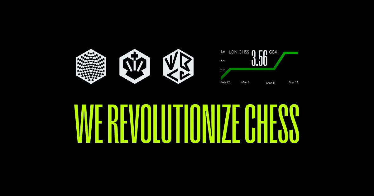
What I learned is that they weren’t just looking for a rebrand of FIDE Online Arena—they wanted a full rebranding for all of World Chess. This crucial detail was something I didn’t know, and honestly, I’m not sure how I was supposed to know it without more direct communication. But I moved forward without that key info, and it led to misalignment.
What I’ll take forward from this experience is the importance of digging deeper into the bigger picture, making sure to have all the information and a clear understanding of the broader vision before jumping into the design phase. Next time, I’ll make sure to foster more conversations with stakeholders to better understand their expectations and goals, ensuring that everyone is aligned from the beginning. It’s about balancing creative exploration with practical insight and keeping the lines of communication open to avoid any surprises along the way.
This project couldn’t have been completed without the incredible support of fellow designers who bring their unique talents to the table: